A Chart of Recent Comrades Marathon Winners
R
running
Using R and {ggplot2} to build a chart of Comrades Marathon winners. The chart breaks down the winners by gender and the number of times that they have won.
Continuing on my quest to document the Comrades Marathon results, today I have put together a chart showing the winners of both the men and ladies races since 1980. Click on the image below to see a larger version.
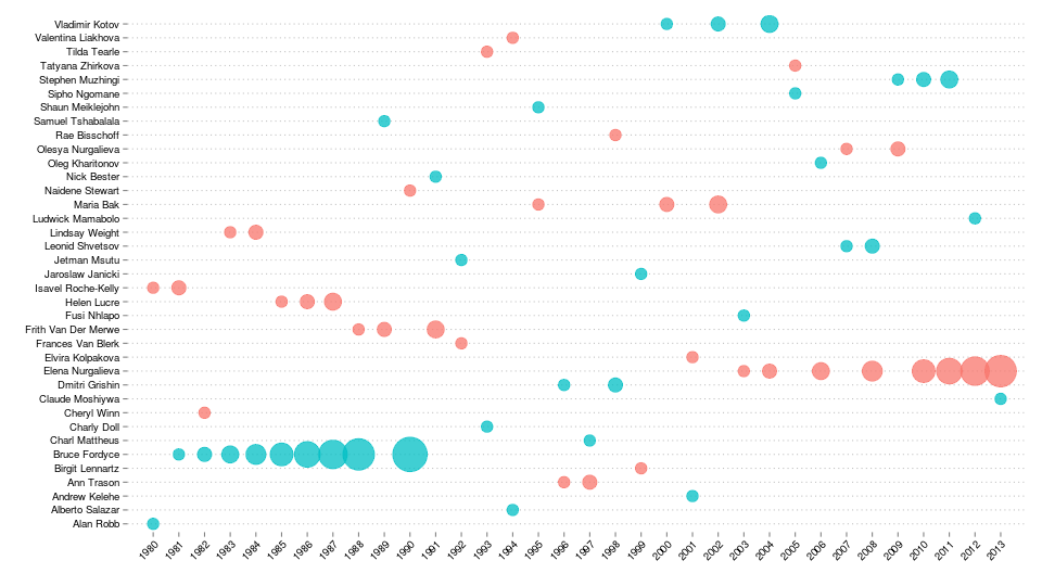
The analysis started off with the same data set that I was working with before, from which I extracted only the records for the winners.
winners = subset(results, gender.position == 1, select = c(year, name, gender, race.time))
head(winners)
year name gender race.time
1 1980 Alan Robb Male 05:38:25
428 1980 Isavel Roche-Kelly Female 07:18:00
3981 1981 Bruce Fordyce Male 05:37:28
4055 1981 Isavel Roche-Kelly Female 06:44:35
7643 1982 Bruce Fordyce Male 05:34:22
7873 1982 Cheryl Winn Female 07:04:59I then added in a field which gives a count of the number of times each person won the race.
library(plyr)
winners = ddply(winners, .(name), function(df) {
     df = df[order(df$year),]
     df$count = 1:nrow(df)
     return(df)
})
subset(winners, name == "Bruce Fordyce")
year name gender race.time count
7 1981 Bruce Fordyce Male 05:37:28 1
8 1982 Bruce Fordyce Male 05:34:22 2
9 1983 Bruce Fordyce Male 05:30:12 3
10 1984 Bruce Fordyce Male 05:27:18 4
11 1985 Bruce Fordyce Male 05:37:01 5
12 1986 Bruce Fordyce Male 05:24:07 6
13 1987 Bruce Fordyce Male 05:37:01 7
14 1988 Bruce Fordyce Male 05:27:42 8
15 1990 Bruce Fordyce Male 05:40:25 9The chart was generated as a scatter plot using ggplot2. The size of the points relates to the number of times each person won the race. The colour scale is as you might imagine: pink for the ladies and blue for the men.
library(ggplot2)

ggplot(winners, aes(x = year, y = name, color = gender)) +
  geom_point(aes(size = count), shape = 19, alpha = 0.75) +
  scale_size_continuous(range = c(5, 15)) +
  ylab("") + xlab("") +
  scale_x_discrete(expand = c(0, 1)) +
  theme(
    axis.text.x = element_text(angle = 45, hjust = 1, colour = "black"),
    axis.text.y = element_text(colour = "black"),
    legend.position = "none",
    panel.background = element_blank(),
    panel.grid.major = element_line(linetype = "dotted", colour = "grey"),
    panel.grid.major.x = element_blank()
  )
Two of the key aspects of getting this to look just right were:
- the call to
scale_size_continuous()which ensured that a reasonable range of point sizes was used and - the call to
scale_x_discrete()which expanded the plot very slightly so that the points near the borders were not cropped.