In the previous installment we generated some simple descriptive statistics for the National Health and Nutrition Examination Survey data. Now we are going to move on to an area in which R really excels: making plots and visualisations.
R has a few packages for plotting, but we will start with base graphics.
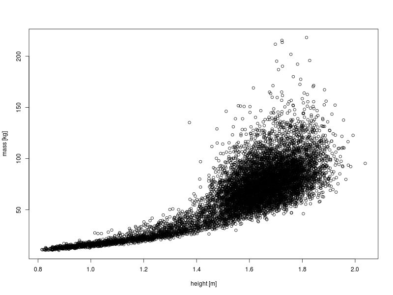
First, make a simple scatter plot of mass against height.
plot(DS0012$height, DS0012$mass, ylab = "mass [kg]", xlab = "height [m]")
This clearly shows the relationship between these two variables, however, there is a high degree of overplotting.
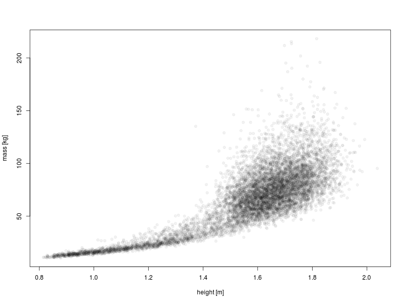
We can improve the overplotting situation by making the points solid but partially transparent.
plot(DS0012$height, DS0012$mass, ylab = "mass [kg]", xlab = "height [m]",
pch = 19, col = rgb(0, 0, 0, 0.05))
That’s much better: now we can see more structure in the data.
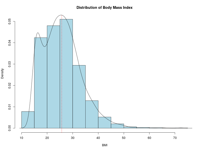
Now let’s look at the distribution of the BMI data using a histogram.
hist(DS0012$BMI, main = "Distribution of Body Mass Index", col = "lightblue",
xlab = "BMI", prob = TRUE)
lines(density(DS0012$BMI))
abline(v = mean(DS0012$BMI), lty = "dashed", col = "red")
I have thrown in a few bells and whistles here: a kernel density estimate of the underlying distribution and a vertical dashed line at the mean value of BMI.
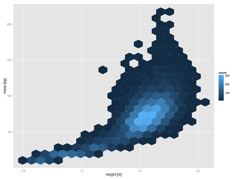
Hexagon binning produces a two dimensional analog of the histogram which can be used to further improve on the visualisation of the mass versus height data above. One option is to use the {hexbin} package. However, in this case I prefer the output from the ggplot2 package.
library(ggplot2)
ggplot(DS0012, aes(x=height,y=mass)) + geom_hex(bins=20) + xlab("height [m]") +
ylab("mass [kg]")
The syntax for ggplot2 is quite different to that of the base R graphics. It takes quite a lot of getting used to, but it is well worth the effort because it is extremely powerful. The appearance of the ggplot2 output is also rather novel.
Well, that was a very quick and high level overview of some of the plotting capabilities in R. Next time we will take a look at plots generated using categorical variables.