A package was recently released to generate plots in the style of xkcd using R. Being a big fan of the cartoon, I could not resist trying it out. I set out to produce something like one of Hans Rosling’s bubble plots.
First I needed some data. Spoilt for choice. I scraped some population data broken down by country and retained only the country and population fields.
library(XML)
library(xlsx)

population.url = "https://en.wikipedia.org/wiki/List\_of\_countries\_by\_population"

download.file(population.url, "data/wiki-population.html")

population = readHTMLTable("data/wiki-population.html", which = 2, trim = TRUE)
After a bit of tidying up, this was ready to use.
head(population)
         region population
1         China 1354040000
2         India 1210569573
3 United States  315901000
4     Indonesia  237641326
5        Brazil  193946886
6      Pakistan  183122000
Next I got my hands on some Gross Domestic Product (GDP) data from the World Bank. These data came as a spreadsheet which could be sucked into R with little effort.
GDP = read.xlsx("data/NY.GDP.MKTP.CD\_Indicator\_MetaData\_en\_EXCEL.xls", 1, stringsAsFactors = FALSE)
I simply retained the entries for 2011, which had few missing values.
Education spending data are also available from the World Bank. These data are a little more patchy, so I kept the most recent value for each country. This required a little fancy footwork.
XPD = read.xlsx("data/SE.XPD.TOTL.GD.ZS_Indicator_MetaData_en_EXCEL.xls", 1,
                stringsAsFactors = FALSE)
After the requisite tidying, these two sets of data were also ready.
head(GDP)
                                     region code          GDP
1                                Arab World  ARB 2.410300e+12
2                    Caribbean small states  CSS 6.178652e+10
3   East Asia & Pacific (all income levels)  EAS 1.880026e+13
4     East Asia & Pacific (developing only)  EAP 9.313033e+12
5                                 Euro area  EMU 1.307986e+13
6 Europe & Central Asia (all income levels)  ECS 2.215649e+13
head(XPD)
                                     region education
1                                Arab World  4.337300
2                    Caribbean small states  6.354870
3   East Asia & Pacific (all income levels)  3.766995
4     East Asia & Pacific (developing only)  4.442010
5                                 Euro area  5.910550
6 Europe & Central Asia (all income levels)  5.478525
Finally I aggregated the three sets of data and removed any rows which were missing either GDP or education statistics. Since there was a range of many orders of magnitude in both the population and GDP data, I took logarithms of these columns.
head(data)
               region code population       GDP education
1         Afghanistan  AFG   7.406542 10.282776   1.72998
2             Albania  ALB   6.450553 10.112590   3.26756
3             Algeria  DZA   7.578639 11.275728   4.33730
6              Angola  AGO   7.314063 11.018416   3.47644
7 Antigua and Barbuda  ATG   4.935986  9.048565   2.53790
8           Argentina  ARG   7.603329 11.649378   5.78195
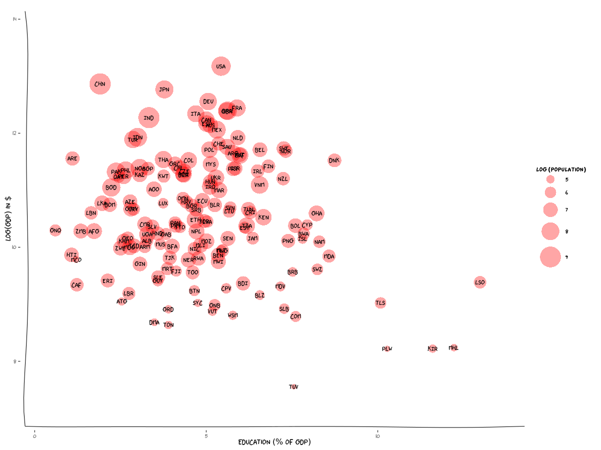
Then came the fun bit: putting the plot together. An introduction to the xkcd package by Emilio Torres-Manzanera got me up to speed. And here is the result. Click on the image below to see it at higher resolution. Interesting that small countries like our neighbour, Lesotho, are spending a large fraction of their GDP on education. Also I must confess to having been previously completely unaware of the existence of Tuvalu (TUV), which is the fourth smallest country in the world (and the smallest country in my data).