Following up on a suggestion from my previous post, here are the statistics for medal count versus age. Every point on the plot is the number (see colour legend on right) of athletes who have achieved a given number of medals by a particular age.
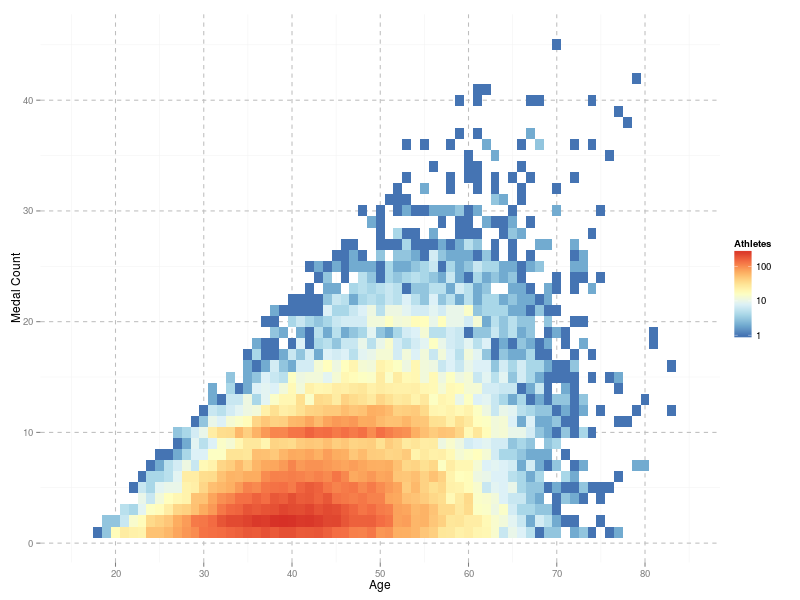
Many people hang on for ten medals, get their Green Number, and then pack it in. Others persevere for a Double Green Number. But evidently there are far fewer people with that kind of commitment or level of craziness.
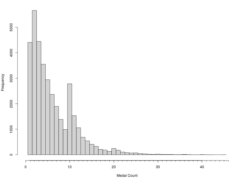
What about the influence of the Back-2-Back medals introduced in 2005? If you look carefully at the plot above then you can see some evidence. However, a simple histogram of medal counts makes the effect irrefutable.
Thanks for the idea, Tilda.