I am busy working on a project which uses data from the World Wide Lightning Location Network (WWLLN). Specifically, I am trying to reproduce some of the results from Orville, Richard E, Gary R. Huffines, John Nielsen-Gammon, Renyi Zhang, Brandon Ely, Scott Steiger, Stephen Phillips, Steve Allen, and William Read. 2001. “Enhancement of Cloud-to-Ground Lightning over Houston, Texas”. Geophysical Research Letters 28 (13): 2597–2600.
This is what the data look like:
head(W)
     lat     lon    dist
1 29.775 -94.649  68.706
2 30.240 -94.270 117.872
3 29.803 -94.418  91.166
4 29.886 -94.342  99.316
5 29.892 -94.085 123.992
6 29.898 -94.071 125.458
attributes(W)$ndays
[1] 1096
I have already pre-processed the data quite extensively and use the geosphere package to add a column giving the distances from the centre of Houston to each lightning discharge. The ndays attribute indicates the number of days included in the data.
I want to plot the density of lightning on a map of the area around Houston. The first step is to get the map data.
library(ggmap)

houston = c(lon = -95.36, lat = 29.76)

houston.map = get_map(location = houston, zoom = 8, color = "bw")
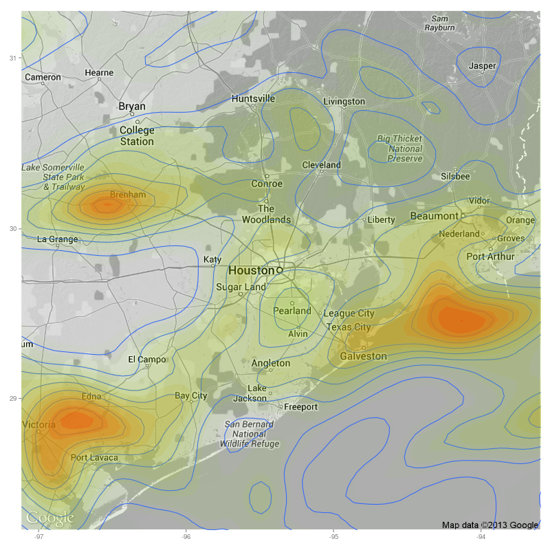
My initial attempt at creating the map used the following:
ggmap(houston.map, extent = "panel", maprange=FALSE) +
    geom_density2d(data = W, aes(x = lon, y = lat)) +
    stat_density2d(data = W, aes(x = lon, y = lat, fill = ..level.., alpha = ..level..),
                  size = 0.01, bins = 16, geom = 'polygon') +
    scale_fill_gradient(low = "green", high = "red") +
    scale_alpha(range = c(0.00, 0.25), guide = FALSE) +
    theme(legend.position = "none", axis.title = element_blank(), text = element_text(size = 12))
And this gave a rather pleasing result. But I was a little uneasy about those contours near the edges: there was no physical reason why they should be running more or less parallel to the boundaries of the plot.
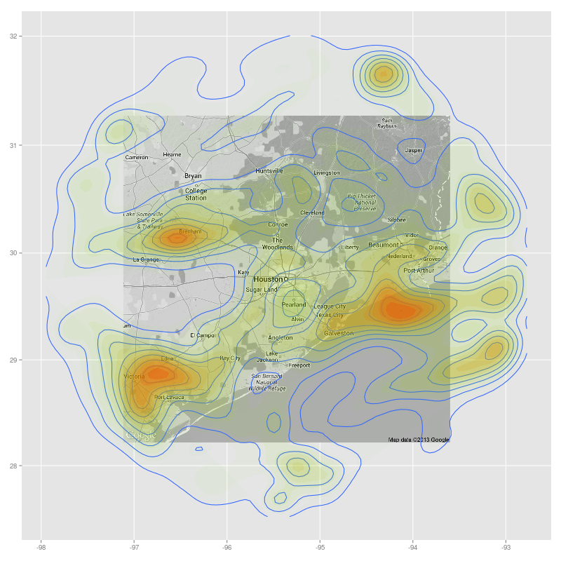
It turns out that my suspicions were well founded. After some fiddling around I found that if I changed the extent argument then I got to see the bigger picture.
ggmap(houston.map, extent = "normal", maprange=FALSE) %+% W + aes(x = lon, y = lat) +
    geom_density2d() +
    stat_density2d(
      aes(fill = ..level.., alpha = ..level..),
      size = 0.01, bins = 16, geom = 'polygon'
    ) +
    scale_fill_gradient(low = "green", high = "red") +
    scale_alpha(range = c(0.00, 0.25), guide = FALSE) +
    theme(legend.position = "none", axis.title = element_blank(), text = element_text(size = 12))
You will also note here a different syntax for feeding the data into ggplot. The resulting plot shows that in my initial plot the data were being truncated at the boundaries of the plot.
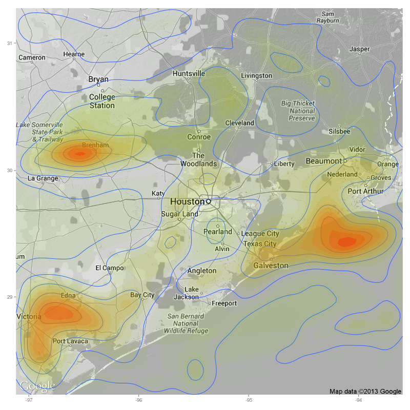
Now at least I have more realistic densities and contours. But, of course, I didn’t want all of that extra space around the map. Not a problem because we can crop the map once the contour and density layers have been added.
ggmap(houston.map, extent = "normal", maprange=FALSE) %+% W + aes(x = lon, y = lat) +
    geom_density2d() +
    stat_density2d(
      aes(fill = ..level.., alpha = ..level..),
      size = 0.01, bins = 16, geom = 'polygon'
    ) +
    scale_fill_gradient(low = "green", high = "red") +
    scale_alpha(range = c(0.00, 0.25), guide = FALSE) +
    coord_map(projection="mercator",
    xlim=c(attr(houston.map, "bb")$ll.lon, attr(houston.map, "bb")$ur.lon),
    ylim=c(attr(houston.map, "bb")$ll.lat, attr(houston.map, "bb")$ur.lat)) +
    theme(legend.position = "none", axis.title = element_blank(), text = element_text(size = 12))
And this gives the final plot, which I think is very pleasing indeed!