Plotting Flows with {riverplot}
I have been looking for an intuitive way to plot flows or connections between states in a process. An obvious choice is a Sankey Plot, but I could not find a satisfactory implementation in R… until I read the post by January Weiner. His {riverplot} package does precisely what I am need.
Getting your data into the right format is a slightly clunky procedure. However, my impression is that the package is still a work in progress and it’s likely that this process will change in the future. For now though, here is an illustration of how a multi-level plot can be constructed.
Assembling the Data
The plan for this example is to have four nodes at each of six layers, with flows between layers. The data are a little contrived, but they illustrate the procedure quite nicely and they produce a result which is not dissimilar to the final plot I was after. We have to create data structures for both nodes and edges. I will start with the edges and then use these data to extract the nodes.
The edges data frame consists of records with a “from” node (N1) and a “to” node (N2) as well as a value for the flow between them. Here I systematically construct a grid of random flows and remove some records to break the symmetry.
edges = data.frame(
  N1 = paste0(rep(LETTERS[1:4], each = 4), rep(1:5, each = 16)),
  N2 = paste0(rep(LETTERS[1:4], 4), rep(2:6, each = 16)),
  Value = runif(80, min = 2, max = 5) * rep(c(1, 0.8, 0.6, 0.4, 0.3), each = 16),
  stringsAsFactors = F
)

edges = edges[sample(c(TRUE, FALSE), nrow(edges), replace = TRUE, prob = c(0.8, 0.2)),]
head(edges)
N1 N2 Value
1 A1 A2 2.3514
4 A1 D2 2.2052
5 B1 A2 3.0959
7 B1 C2 2.8756
9 C1 A2 4.5099
10 C1 B2 4.1782The names of the nodes are then extracted from the edge data frame. Horizontal and vertical locations for the nodes are calculated based on the labels. These locations are not strictly necessary because the package will work out sensible default values for you.
nodes = data.frame(ID = unique(c(edges$N1, edges$N2)), stringsAsFactors = FALSE)
#
nodes$x = as.integer(substr(nodes$ID, 2, 2))
nodes$y = as.integer(sapply(substr(nodes$ID, 1, 1), charToRaw)) - 65
#
rownames(nodes) = nodes$ID
head(nodes)
ID x y
A1 A1 1 0
B1 B1 1 1
C1 C1 1 2
D1 D1 1 3
A2 A2 2 0
B2 B2 2 1Finally we construct a list of styles which will be applied to each node. It’s important to choose suitable colours and introduce transparency for overlaps (which is done here by pasting “60” onto the RGB strings).
library(RColorBrewer)
#
palette = paste0(brewer.pal(4, "Set1"), "60")
#
styles = lapply(nodes$y, function(n) {
  list(col = palette[n+1], lty = 0, textcol = "black")
})
names(styles) = nodes$ID
Constructing the riverplot Object
Now we are in a position to construct the riverplot object. We do this by joining the node, edge and style data structures into a list and then adding "riverplot" to the list of class attributes.
library(riverplot)

rp <- list(nodes = nodes, edges = edges, styles = styles)
#
class(rp) <- c(class(rp), "riverplot")
Producing the plot is then simple.
plot(rp, plot_area = 0.95, yscale=0.06)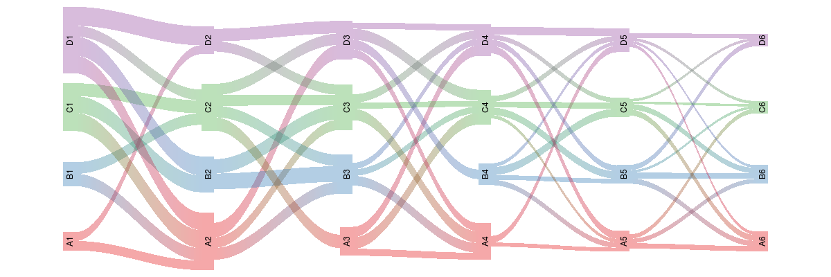
Conclusion
I can think of a whole host of applications for figures like this, so I am very excited about the prospects. I know that I am going to have to figure out how to add additional labels to the figures, but I’m pretty sure that will not be too much of an obstacle.
The current version of {riverplot} is v0.3. Incidentally, when I stumbled on a small bug in v0.2 of {riverplot}, January was very quick to respond with a fix.