A few years ago I ordered a copy of the 2005 edition of Creating More Effective Graphs by Naomi Robbins. Somewhat shamefully I admit that the book got buried beneath a deluge of papers and other books and never received the attention it was due. Having recently discovered the R Graph Catalog, which implements many of the plots from the book using ggplot2, I had to dig it out and give it some serious attention.
Both the book and web site are excellent resources if you are looking for informative ways to present your data.
Being a big fan of xkcd, I rather enjoyed the example plot in xkcd style (which I don’t think is covered in the book…). The code provided on the web site is used as the basis for the plot below.
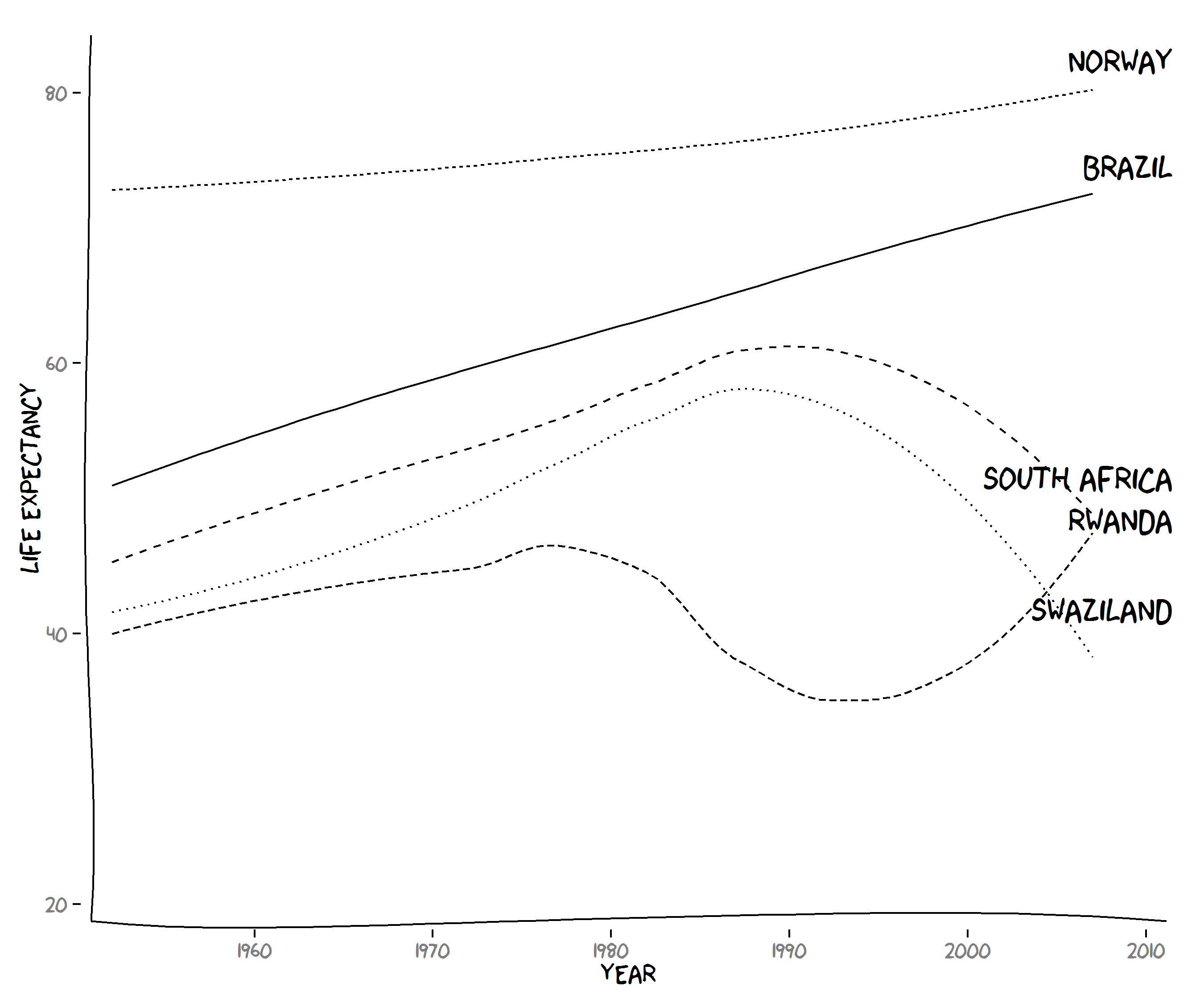
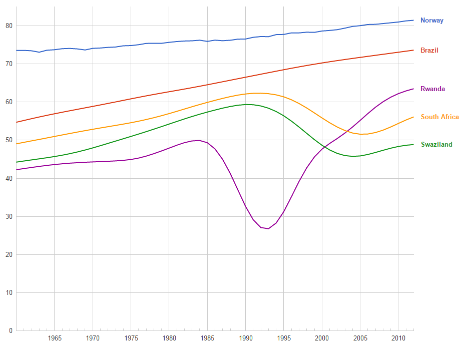
This plot is broadly consistent with the data from the Public Data archive on Google, but the effects of smoothing in the xkcd style plot can be clearly seen. Is this really important? Well, I suppose that depends on the objective of the plot. If it’s just to inform (and look funky in the process), then the xkcd plot is perfectly fine. If you are looking for something more precise, then a more conventional plot without smoothing would be more appropriate.
I like the xkcd style plot though and here’s the code for generating it, loosely derived from the code on the web site.
library(ggplot2)
library(xkcd)

countries <- c("Rwanda", "South Africa", "Norway", "Swaziland", "Brazil")

hdf <- droplevels(subset(read.delim(file = "http://tiny.cc/gapminder"), country %in% countries))

direct_label <- data.frame(
  year = 2009,
  lifeExp = hdf$lifeExp[hdf$year == 2007],
  country = hdf$country[hdf$year == 2007]
)

set.seed(123)

ggplot() +
  geom_smooth(data = hdf,
              aes(x = year, y = lifeExp, group = country, linetype = country),
              se = FALSE, color = "black") +
  geom_text(aes(x = year + 2.5, y = lifeExp + 3, label = country), data = direct_label,
            hjust = 1, vjust = 1, family = "xkcd", size = 7) +
  theme(legend.position = "none") +
  ylab("Life Expectancy") +
  xkcdaxis(c(1952, 2010), c(20, 83))