R Recipe: Aligning Axes in ggplot2
Faceted plots in ggplot2 are phenomenal. They give you a simple way to break down an array of plots according to the values of one or more categorical variables. But what if you want to stack plots of different variables? Not quite so simple. But certainly possible. I gathered together this solution from a variety of sources on Stack Overflow, notably this one and this other one. A similar issue for vertical alignment is addressed here.
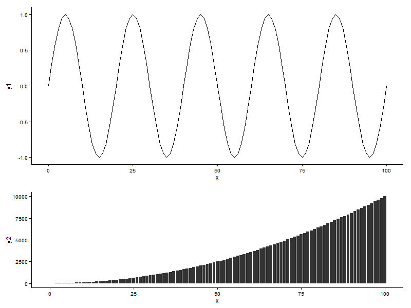
To illustrate, first let’s generate some sample data.
data <- data.frame(x = seq(0, 100, 1))
#
data = transform(
  data,
  y1 = sin(x * pi / 10),
  y2 = x**2
)
Then we’ll import a couple of libraries: ggplot2, of course, and gridExtra which will give us the stacking functionality.
library(ggplot2)
library(grid)
library(gridExtra)
We’ll generate the two plots.
p1 <- ggplot(data, aes(x = x)) + geom_line(aes(y = y1)) + theme_classic()
p2 <- ggplot(data, aes(x = x)) + geom_bar(aes(y = y2), stat = "identity") + theme_classic()
We could just slap these plots onto a grid, which would produce an acceptable plot. But my inner perfectionist is not happy with the fact that the two vertical axes do not line up and, consequently, the horizontal scales are slightly different.
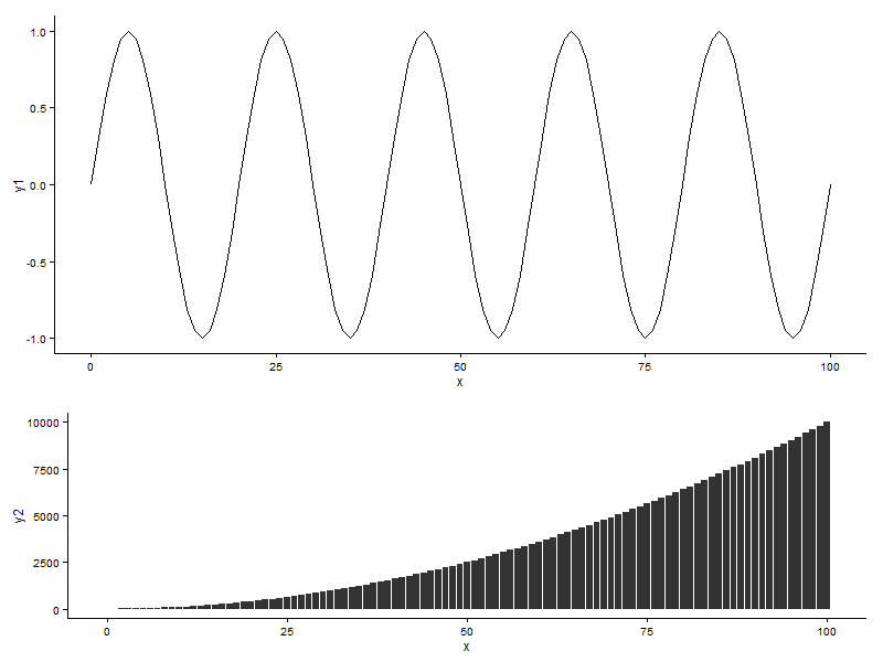
The first step towards fixing this small issue is to take the plots and convert them into gtable objects.
p1 <- ggplot_gtable(ggplot_build(p1))
p2 <- ggplot_gtable(ggplot_build(p2))
Next the pivotal bit: find the widths of each of the plots, calculate the maximum and then apply it to each of them individually. This effectively applies a uniform layout to each of the plots.
maxWidth = unit.pmax(p1$widths[2:3], p2$widths[2:3])

p1$widths[2:3] <- maxWidth
p2$widths[2:3] <- maxWidth
And the final result is a stacked plot with perfectly aligned vertical axes. Success!
grid.arrange(p1, p2, heights = c(3, 2))