As an aside for a Social Media Automation project I have constructed a bot which uses data from the World Wide Lightning Location Network (WWLLN) to construct daily animated maps of global lightning activity and post them on my Twitter feed. The bot runs remotely and autonomously on an EC2 instance.
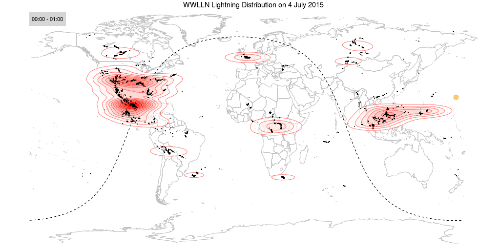
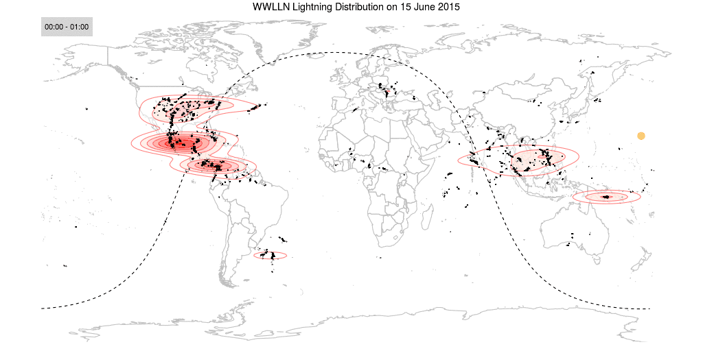
The images below are two examples of the lightning animations. You might need to open them in a separate tab or window to get them to animate. WordPress funkiness, I believe! If you would like to see these daily, follow @DataWookie.
Data Acquisition
New data are posted on a HTTP site every day. The bot needs to check for the availability of new data and then download it. The data were then loaded into R as a data.frame. Some elementary transformations were applied, like transforming the time of day into a floating point hour. The data were then split into 24 one hour segments.
Unfortunately there is a delay of a few days in the availability of the WWLLN data.
Plotting the Map
I made maps for each of the data segments. These maps were generated using ggplot2, which has functionality for creating a layer with map borders. I might consider a more elegant map at a later stage, but this gets the job done for now. On top of the map I applied two more layers reflecting the density of lightning strokes with shading and contours. On top of that went another layer with the point locations of the lightning strokes.
Plotting the Terminator
I wanted to indicate the passage of the day-night terminator across the map. The first step was to calculate the position of the Sun. Since I know the date and UTC time for each of the frames in the animation, it was a relatively simple matter to find the latitude and longitude respectively of the sub-solar point. Actually I had an awk script lying around which did this for a range of dates and times, so it was easy to cannibalise the maths out of that.
Getting the terminator line itself was a little more tricky. My plan was to start with points along a great circle path aligned with the prime meridian and then tilt this path appropriately. Although I am sure that I should know the elements of the required rotation matrix, I’m afraid that they had somehow slipped through my mental cracks. To make matters slightly worse, I was writing this code on a flight, so I did not have access to the internet. Undeterred I broke the transformation down into two components: a polar tilt followed by an azimuthal rotation. Those matrices I could figure out from first principles. Once I had that working, a dose of matrix multiplication composed them into the single transformation matrix I was looking for originally. Sorted!
Creating the Animation
The maps were spliced together into an animated GIF using convert from the ImageMagick package. The resulting GIFs were pretty huge. The maps had been rendered at 1024 by 512 pixel resolution, so they were fairly high definition to start with. I then used gifsicle to optimise the GIF, reducing to 64 colours at the same time. The resulting animations did not exhibit any perceptible degradation and were a bunch smaller.
Wrapping it Up
The GIFs and a short bit of text were then uploaded using the Twitter API. A final step was to archive the data, which I shifted across to a private folder on the cloud using the rdrop2 package. All of this went into a single R script, which is run as a daily cron job on my EC2 instance.