There’s a variety of options for plotting in Julia. We’ll focus on those provided by Gadfly and Plotly.
Gadfly
Gadfly is the flavour of the month for plotting in Julia. It’s based on the Grammar of Graphics, so users of ggplot2 should find it familiar.
![]()
To start using Gadfly we’ll first need to load the package. To enable generation of PNG, PS, and PDF output we’ll also want the Cairo package.
using Gadfly
using Cairo
You can easily generate plots from data vectors or functions.
plot(x = 1:100, y = cumsum(rand(100) - 0.5), Geom.point, Geom.smooth)
plot(x -> x^3 - 9x, -5, 5)
Gadfly plots are by default rendered onto a new tab in your browser. These plots are mildly interactive: you can zoom and pan across the plot area. You can also save plots directly to files of various formats.
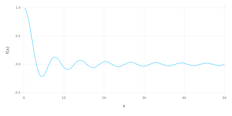
dampedsin = plot([x -> sin(x) / x], 0, 50)
draw(PNG("damped-sin.png", 800px, 400px), dampedsin)
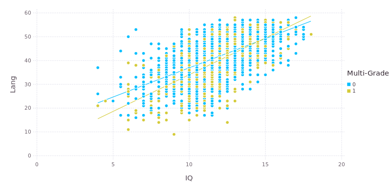
Let’s load up some data from the nlschools dataset in R’s MASS package and look at the relationship between language score test and IQ for pupils broken down according to whether or not they are in a mixed-grade class.
using RDatasets
plot(dataset("MASS", "nlschools"), x="IQ", y="Lang", color="COMB",
            Geom.point, Geom.smooth(method=:lm), Guide.colorkey("Multi-Grade"))
Those two examples just scratched the surface. Gadfly can produce histograms, boxplots, ribbon plots, contours and violin plots. There’s detailed documentation with numerous examples on the homepage.
Watch the video below (Daniel Jones at JuliaCon 2014) then read on about Plotly.
Plotly
The Plotly package provides a complete interface to plot.ly, an online plotting service with interfaces for Python, R, MATLAB and now Julia. To get an idea of what’s possible with plot.ly, check out their feed. The first step towards making your own awesomeness with be loading the package.
using Plotly
Next you should set up your plot.ly credentials using Plotly.set_credentials_file(). You only need to do this once because the values will be cached.
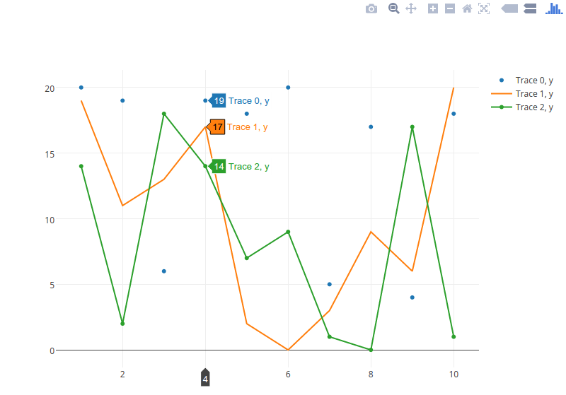
Data series are stored in Julia dictionaries.
p1 = ["x" => 1:10, "y" => rand(0:20, 10), "type" => "scatter", "mode" => "markers"];
p2 = ["x" => 1:10, "y" => rand(0:20, 10), "type" => "scatter", "mode" => "lines"];
p3 = ["x" => 1:10, "y" => rand(0:20, 10), "type" => "scatter", "mode" => "lines+markers"];
Plotly.plot([p1, p2, p3], ["filename" => "basic-line", "fileopt" => "overwrite"])
Dict{String,Any} with 5 entries:
  "error"    => ""
  "message"  => ""
  "warning"  => ""
  "filename" => "basic-line"
  "url"      => "https://plot.ly/~collierab/17"
You can either open the URL provided in the result dictionary or do it programmatically:
Plotly.openurl(ans["url"])
By making small jumps through similar hoops it’s possible to create some rather intricate visualisations like the 3D scatter plot below. For details of how that was done, check out my code on GitHub.
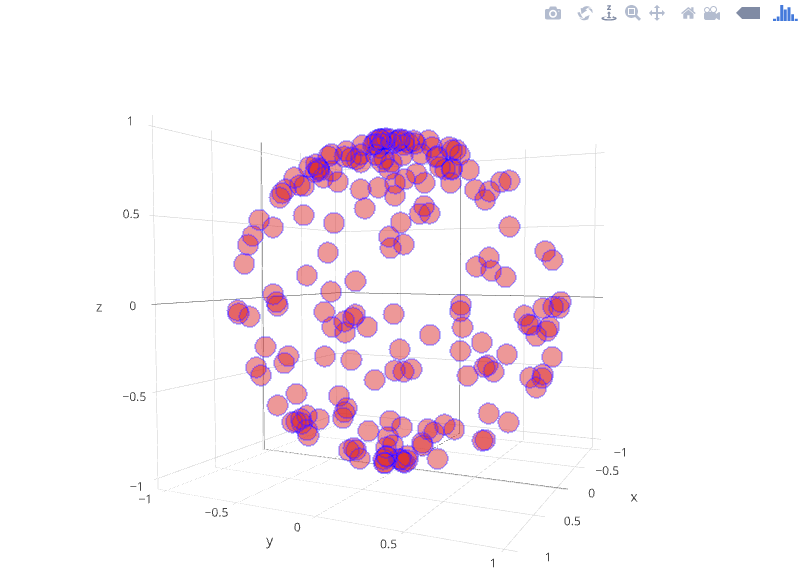
That was a static version of the plot. However, one of the major perks of Plotly is that the plots are interactive. Plus you can embed them in your site and it will, in turn, benefit from the interactivity. Feel free to interact vigorously with the plot below.
Google Charts
There’s also a fledgling interface to Google Charts.
Obviously plotting and visualisation in Julia are hot topics. Other plotting packages worth checking out are PyPlot, Winston and Gaston. Come back tomorrow when we’ll take a look at using physical units in Julia.