The recently published 2015 Data Science Salary Survey conducted by O’Reilly takes a look at the salaries received, tools used and other interesting facts about Data Scientists around the World. Download the report as PDF. It’s based on a survey of over 600 respondents from a variety of industries. The entire report is well worth a read, but I’ve picked out some highlights below.
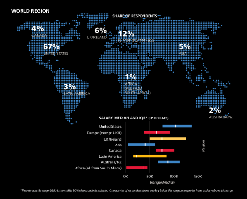
The majority (67%) of the respondents in the survey were from the United States. They also demanded the highest median salaries across the globe. At the other end of the spectrum (and relevant to me personally), only 1% of the respondents were from Africa. These represented only one country: South Africa. The lowest salaries overall were recorded in Africa, while the lowest median salaries were found in Latin America.
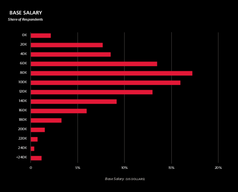
In aggregate there’s a fairly broad distribution of Data Science salaries, with some earning more than 240k USD per annum. The majority are taking home around 80k USD.
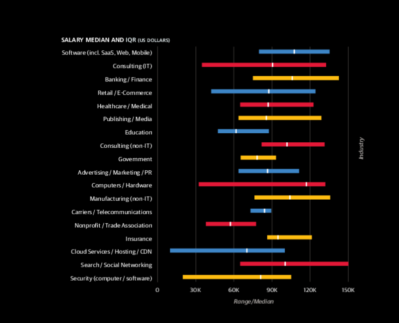
Partitioning the data according to industry they found that there’s a reasonable degree of variability, with the highest salaries being paid in the Search and Social Networking space and the lowest in the Cloud Services, Hosting and Content Delivery Network industries. Most industries offer median salaries between 60k USD and 120k USD, with the Non-Profit and Trade Association sector being the only exception, falling just short of this range. The highest median salaries are found in the Hardware sector.
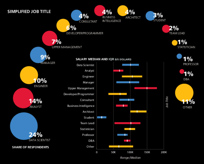
The majority (24%) of respondents were nominally Data Scientists, with median salary of around 100k USD. The highest paid were the 7% of respondents in Upper Management, while the lowest pay went to the 3% who were Students. Don’t worry guys, your time will come!
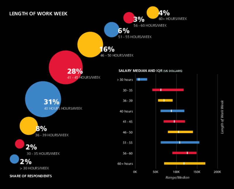
There’s a clear relationship between remuneration and the number of hours worked per week. As one would expect, those who work more get paid more. This relationship holds all the way up to those who work more than 60 hours per week, where there is a dip in median salary. Seems to me that there might be a hint of exploitation there!
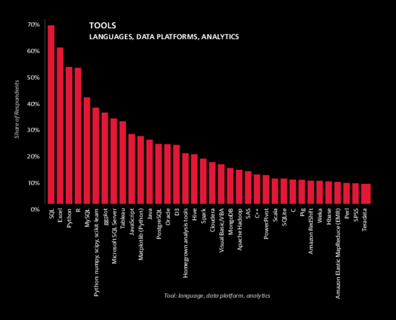
The most commonly used tools, in order of decreasing importance, are SQL, Excel, Python and R. These four tools have been on top of the heap for three years running. I’m honestly a little surprised that Excel still has such a large market share. Scala is down in position 26, yet of these commonly used tools it’s associated with the highest median salary. Interestingly (and not too surprisingly) some of the more niche tools command higher salaries.
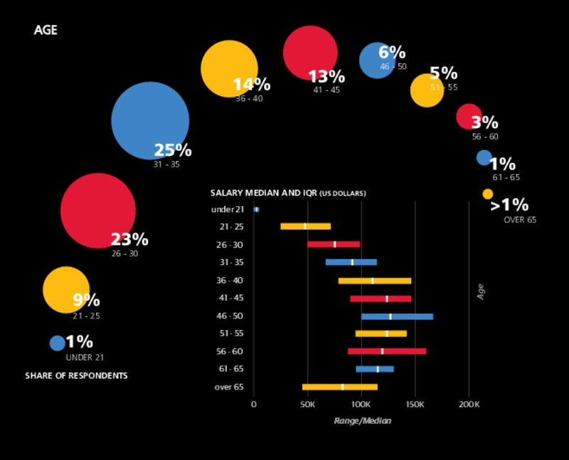
With respect to age, those in the 46-50 years group are getting paid the most, although they represent only 6% of the respondents. These guys are obviously at the peak of their profession. The most populous age group is 31-35 years. They’re earning significantly less than their more senior colleagues, but the escalation in salaries with age should give them hope for a prosperous future.
Finally, in terms of gender, roughly 80% of the respondents were male and are being paid significantly more than their female counterparts (when all other variables are accounted for). Not cool, especially given that some of the most talented Data Scientists I know are female!
For more details, have a look at the complete survey: it’s well worth a read!
📢 Update: The 2016 edition of the survey is now available. Read it online here or download in PDF.