Walmart Trip Type Classification was my first real foray into the world of Kaggle and I’m hooked. I previously dabbled in What’s Cooking but that was as part of a team and the team didn’t work out particularly well. As a learning experience the competition was second to none. My final entry put me at position 155 out of 1061 entries which, although not a stellar performance by any means, is just inside the top 15% and I’m pretty happy with that. Below are a few notes on the competition.
Before I get started, congratulations to the competitors at the top of the leaderboard! You guys killed it.
Data Preparation
Getting to my final model was quite a process, with many moments of frustration, disappointment, enlightenment and exhilaration along the way.
The first step was to clean up the data. Generally it appeared to be in pretty good shape, with nothing extraordinary jumping out at me. There were some minor issues though, for example, department labels for both “MENSWEAR” and “MENS WEAR”, which needed to be consolidated into a single category.
My initial submission was a simple decision tree. This was an important part of the process for me because it established that I had a working analysis pipeline, a submission file in valid format, and a local value of the evaluation metric which was consistent with that on the public leaderboard. Submissions were gauged according to log loss and my first model scored 2.79291, quite a bit better than the Random Forest & Department Description benchmark at 5.77216, but still nowhere near competitive.

I then did a few very elementary things with the data and applied an XGBoost model, which resulted in a significant bump in model performance. I hadn’t worked with XGBoost before and I discovered what some of the hype’s about: even with the default parameters it produces an excellent model. It’s also blazing fast.

That result was a lot more respectable. Time to dig deeper.
Feature Engineering
I realised that I would only be able to go so far with the existing features. Time to engineer some new ones. After taking a cursory look at the data, a few obvious options emerged:
- the number of departments visited;
- the total number of items bought (PositiveSum) or returned (NegativeSum);
- the net number of items bought (WholeSum, being the difference between PositiveSum and NegativeSum);
- the number of departments from which items were bought (DepartmentCount); and
- groupings of various departments, giving new categories like Grooming (a combination of BEAUTY and PERSONAL_CARE), Baby (INFANT_APPAREL and INFANT_CONSUMABLE_HARDLINES) and Clothes (everything relating to clothing from BOYS_WEAR to PLUS_AND_MATERNITY).
Throwing those into the mix provided another, smaller improvement.

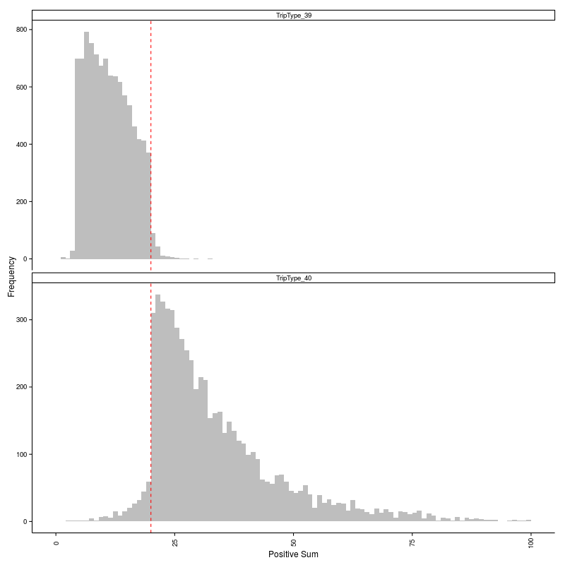
To see why these new features were effective, take a look at the data below which illustrates the clear distinction in the distribution of PositiveSum for trip types 39 and 40.
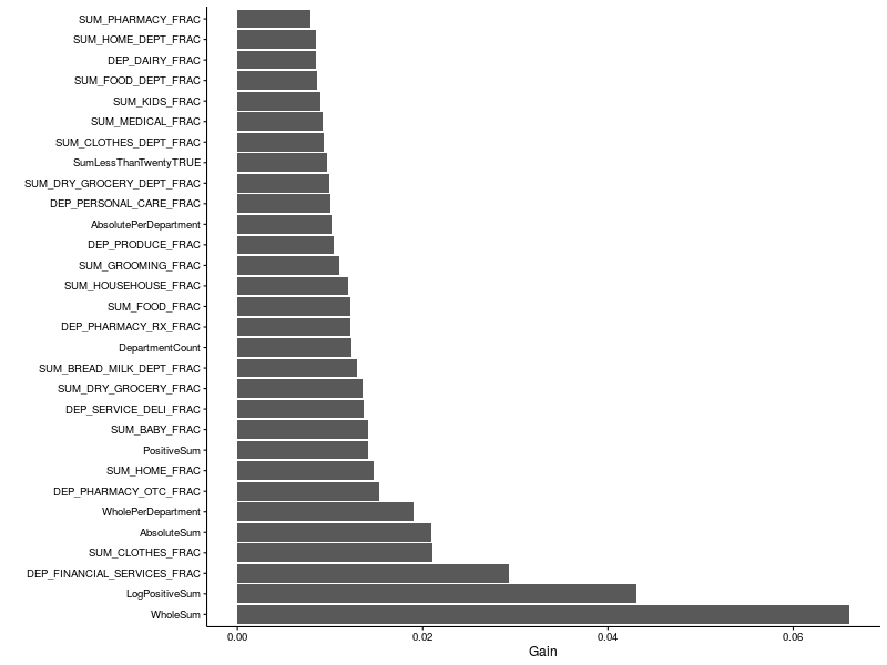
Below are the relative feature importances generated by one of my models. It’s evident that both the WholeSum and PositiveSum (or its logarithm) were important. Clothes and financial services also featured highly.
Enough about my attempts, let’s scope the leaderboard.
Leaderboard Analysis
I discovered something interesting while trolling the bottom end of the leaderboard page: you can download statistics for all competition entries. The data are presented as a CSV file. Here’s the head.
TeamId,TeamName,SubmissionDate,Score
230879,HulkBulk,"2015-10-26 18:58:32",34.53878
230879,HulkBulk,"2015-10-26 19:49:31",10.42797
230879,HulkBulk,"2015-10-26 20:03:20",7.90711
230907,"Bojan Tunguz","2015-10-26 20:12:06",34.53878
230938,Sadegh,"2015-10-26 21:41:55",34.53878
230940,"Paul H","2015-10-26 21:56:17",34.53878
230942,NxGTR,"2015-10-26 22:06:44",34.53878
230945,Chippy,"2015-10-26 22:14:40",3.44965
230940,"Paul H","2015-10-26 22:16:57",32.29692
Let’s first look at the distribution of best and worst scores per competitor. The histogram below shows a peak in both best and worst scores around the “All Zeros Benchmark” at 34.53878. The majority of the field ultimately achieved best scores below 5.
Scrutinising the distribution of best scores reveals a peak between 0.6 and 0.7. Only a small fraction of the competitors (6.3%) managed to push below the 0.6 boundary, leaving the elite few (0.6%) with final scores below 0.5.
        group count percent
       (fctr) (int)   (dbl)
1  (0.45,0.5]     6  0.5655
2  (0.5,0.55]    21  1.9793
3  (0.55,0.6]    40  3.7700
4  (0.6,0.65]    93  8.7653
5  (0.65,0.7]    75  7.0688
6  (0.7,0.75]    39  3.6758
7  (0.75,0.8]    32  3.0160
8  (0.8,0.85]    31  2.9218
9  (0.85,0.9]    46  4.3355
10 (0.9,0.95]    21  1.9793
The scatter plot below shows the relationship between best and worst scores broken down by competitor.
Overplotting kind of kills that. Obviously a scatter plot is not the optimal way to visualise those data. A contour map offers a better view, yielding three distinct clusters: competitors who started off close to the “All Zeros Benchmark” and stayed there; ones who debuted near to the “All Zeros Benchmark” and subsequently improved dramatically and, finally, those whose initial entries were already substantially better than the “All Zeros Benchmark”.
Next I looked for a pattern in the best or worst submissions as a function of first submission date. There’s certainly evidence to suggest that many of the more competitive best scores were achieved by people who jumped onto this competition within the first week or so. Later in the competition there were more days when people joined the competition who would ultimately achieve poorer scores.
There’s less information to be gleaned from looking at the same data against the date of last submission. Throughout the competition there were final entries from competitors that were close to the “All Zeros Benchmark”. What happened to them? Were they discouraged or did they team up with other competitors?
The number of submissions per day remained consistently between 50 and 100 until the middle of December when it ramped up significantly, reaching a peak of 378 submissions on the last day of the competition. Of the entries on the final day, almost 20% were made during the last hour before the competition closed.
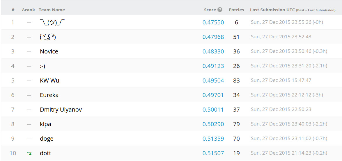
The box plot below indicates that there’s a relationship between the number of submissions and best score, with competitors who made more submissions generally ending up with a better final score. There are, of course, exceptions to this general rule. The winner (indicated by the orange square) made only 6 submissions, while the rest of the top ten competitors made between 19 and 83 entries.
Some of the competitors have posted their work on a source code thread in the Forums. There will be a lot to learn by browsing through that.
I’ve just finished the Santa’s Stolen Sleigh competition and I’ll be reporting on that in a few days time. Also working on a solution for the Homesite Quote Conversion competition, which is providing a new range of challenges.