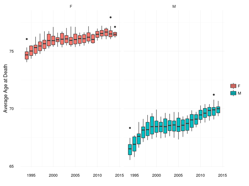
I’ve added mortality data to the lifespan package. A result that immediately emerges from these data is that average life expectancy is steadily climbing.
library(lifespan)
ggplot(deaths, aes(x = year, y = avgage)) +
    geom_boxplot(aes(group = year, fill = sex)) +
    facet_wrap(~ sex) +
    labs(x = "", y = "Average Age at Death") +
    theme_minimal() + theme(legend.title = element_blank())
The effect is more pronounced for men, rising from around 66.5 in 1994 to 70.0 in 2014. The corresponding values for women are 74.6 and 76.5 respectively. Good news for everyone.
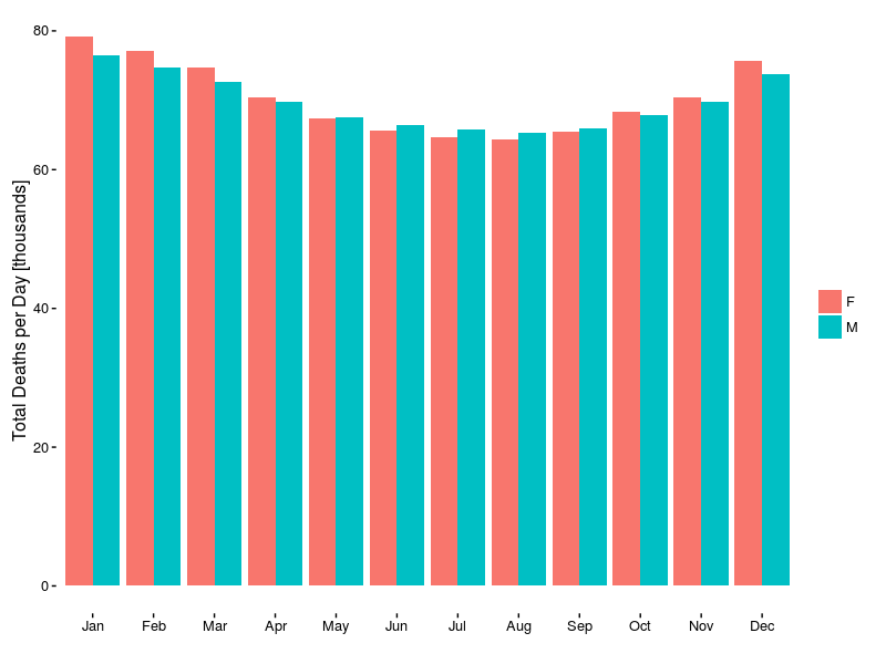
When do most deaths occur? It would seem that the peak lies in Winter, specifically January. There is a broad trough during the Summer months. Fractionally more women die in Winter, whereas slightly more men die during Summer.