I was rather inspired by this plot on Wikipedia’s List of Countries by Life Expectancy.
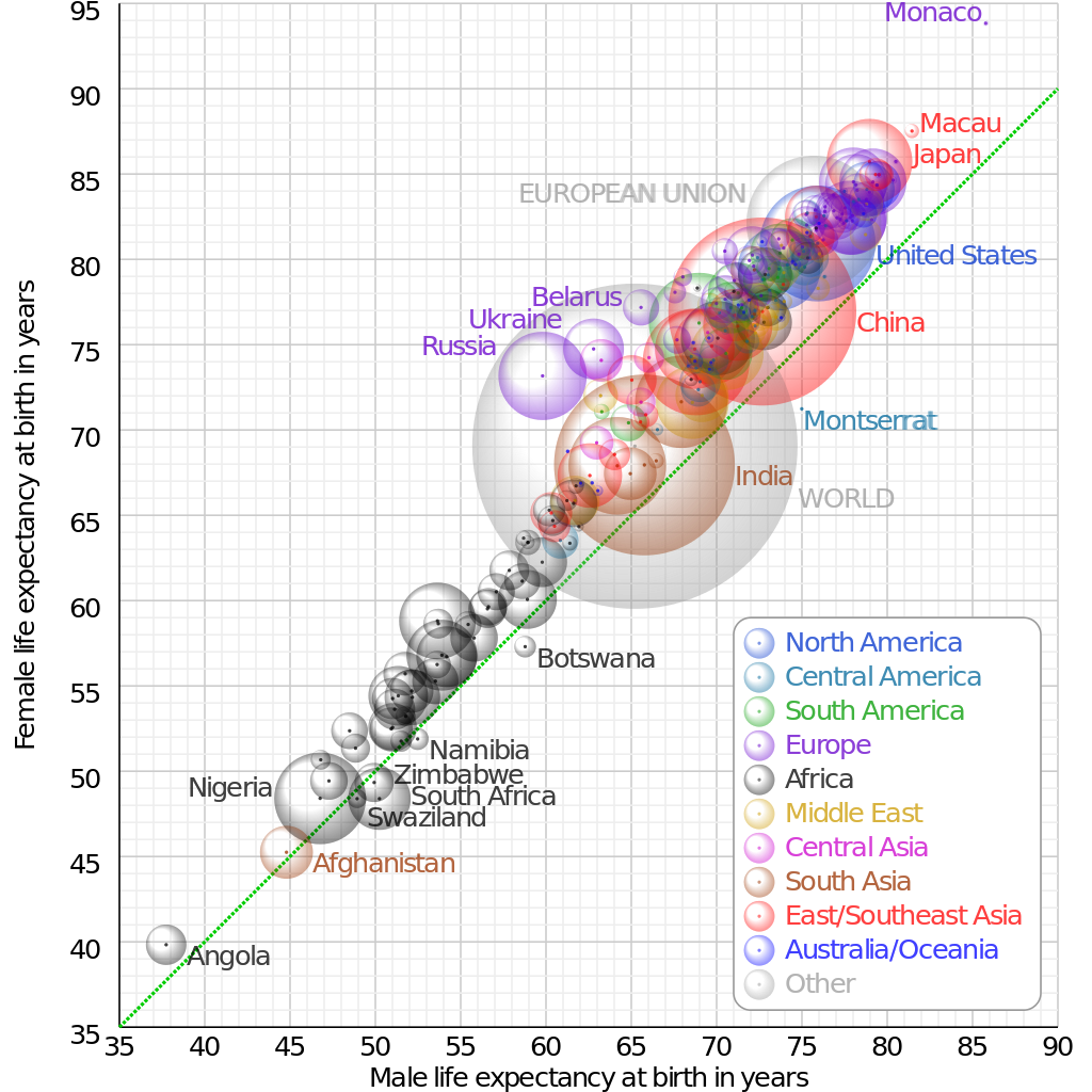
Shouldn’t be too hard to reproduce with a bit of scraping. Here are the results (click on the static image to view the interactive plot):
The bubble plot above compares female and male life expectancies for a number of countries. The diagonal line corresponds to equal female and male life expectancy. The size of each bubble is proportional to the corresponding country’s population while its colour indicates its continent. Countries in Africa generally have the lowest life expectancies, while those in Europe are generally the highest. Since all of the bubbles are located above the diagonal, we find that females consistently live longer than males, regardless of country.
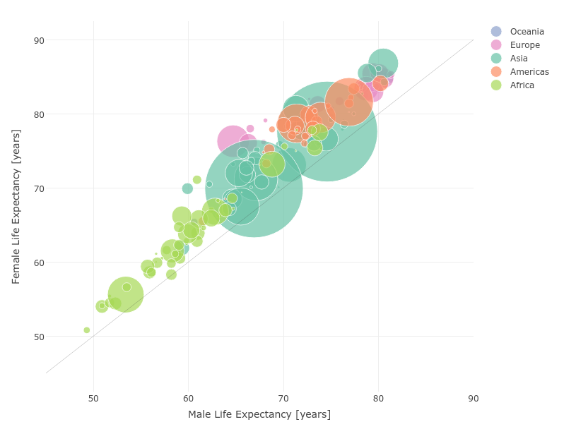
Check out a similar analysis done using Julia.