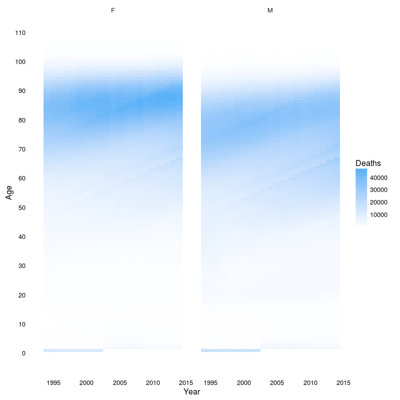
Taking another look at the data from the lifespan package. Plot below shows the evolution of mortality in the US as a function of year and age.
library(lifespan)
library(ggplot2)
ggplot(deathsage, aes(x = year, y = age)) +
    geom_raster(aes(fill = count)) +
    labs(x = "Year", y = "Age") +
    scale_y_continuous(breaks = seq(0, 120, 10), limits = c(0, 110)) +
    scale_fill_gradient("Deaths", low = "#FFFFFF") +
    facet_wrap(~ sex) +
    theme_minimal() +
    theme(panel.grid = element_blank())
Also, based on a suggestion from @robjohnnoble, population data have been included in the package.
tail(population)
    year  count
112 2011 310.50
113 2012 312.86
114 2013 315.18
115 2014 317.68
116 2015 320.22
117 2016 322.48