Working further with the mortality data from https://www.cdc.gov/, I’ve added a breakdown of deaths by age and gender to the lifespan package on GitHub.
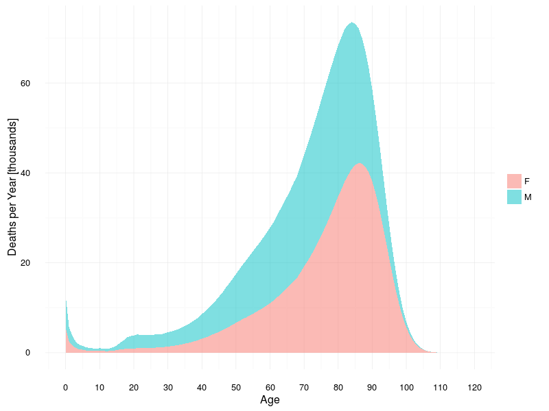
Here’s a summary plot:
library(lifespan)
NYEARS = length(unique(deaths$year))
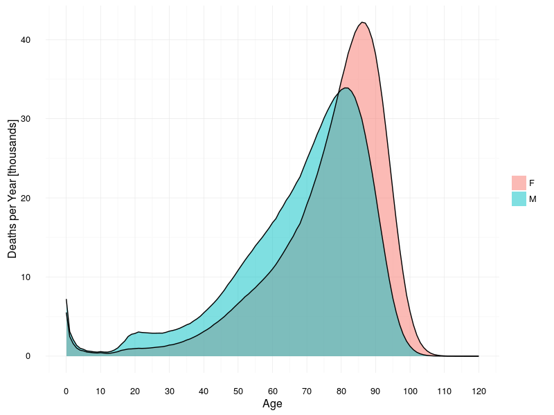
ggplot(deathsage, aes(x = age, y = count / NYEARS / 1000)) +
geom_area(aes(fill = sex), position = "identity", alpha = 0.5) +
geom_line(aes(group = sex)) +
# facet_wrap(~ sex, ncol = 1) +
labs(x = "Age", y = "Deaths per Year [thousands]") +
scale_x_continuous(breaks = seq(0, 150, 10), limits = c(0, 120)) +
theme_minimal() + theme(legend.title = element_blank())
There are a few interesting observations to be made. We’ll start with the most obvious:
- on average, females live longer than males;
- modal age at death is 81 for males and 86 for females;
- there are more infant deaths among males than females (probably linked to greater number of male births); and
- there is a rapid escalation in deaths among teenage males (consistent with fact that teenage males are more likely to commit suicide, be involved in fatal vehicle accidents, or be victims of homicide).