Kyle Walker’s pyramid plots gave me a serious case of visualisation envy. Here’s something similar using the mortality data from the lifespan package.
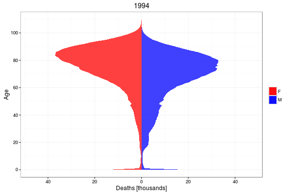
The change in the mortality profile from year to year over two decades is evident. There are unmistakable peaks which propagate up the plot, corresponding to babies born in 1943 and 1947, around the start and just after the Second World War.