I’m generally not too interested in fitting analytical distributions to my data. With large enough samples (which I am normally fortunate enough to have!) I can safely assume normality for most statistics of interest.
Recently I had a relatively small chunk of data and finding a decent analytical approximation was important. I had a look at the tools available in R for addressing this problem. The {fitdistrplus} package seemed like a good option. Here’s a sample workflow.
Create some Data
To have something to work with, generate 1000 samples from a log-normal distribution.
N <- 1000

set.seed(37)
#
x <- rlnorm(N, meanlog = 0, sdlog = 0.5)
Skewness-Kurtosis Plot
Load up the package and generate a skewness-kurtosis plot.
library(fitdistrplus)

descdist(x)
summary statistics
--
min: 0.2391517 max: 6.735326
median: 0.9831923
mean: 1.128276
estimated sd: 0.6239416
estimated skewness: 2.137708
estimated kurtosis: 12.91741
There’s nothing magical in those summary statistics, but the plot is most revealing. The data are represented by the blue point. Various distributions are represented by symbols, lines and shaded areas.
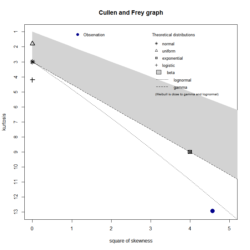
We can see that our data point is close to the log-normal curve (no surprises there!), which indicates that it is the most likely distribution.
We don’t need to take this at face value though because we can fit a few distributions and compare the results.
Fitting Distributions
We’ll start out by fitting a log-normal distribution using fitdist().
fit.lnorm = fitdist(x, "lnorm")
fit.lnorm
Fitting of the distribution ' lnorm ' by maximum likelihood
Parameters:
            estimate Std. Error
meanlog -0.009199794 0.01606564
sdlog    0.508040297 0.01135993
plot(fit.lnorm)
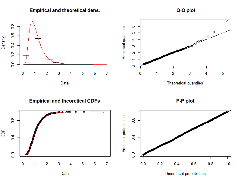
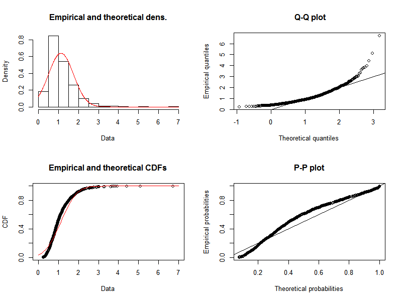
The quantile-quantile plot indicates that, as expected, a log-normal distribution gives a pretty good representation of our data. We can compare this to the results of fitting a normal distribution, where we see that there is significant divergence of the tails of the quantile-quantile plot.
Comparing Distributions
If we fit a selection of plausible distributions then we can objectively evaluate the quality of those fits.
fit.metrics <- lapply(ls(pattern = "fit\\."), function(variable) {
    fit = get(variable, envir = .GlobalEnv)
    with(fit, data.frame(name = variable, aic, loglik))
})
do.call(rbind, fit.metrics)
       name      aic     loglik
1   fit.exp 2243.382 -1120.6909
2 fit.gamma 1517.887  -756.9436
3 fit.lnorm 1469.088  -732.5442
4 fit.logis 1737.104  -866.5520
5  fit.norm 1897.480  -946.7398
According to these data the log-normal distribution is the optimal fit: smallest AIC and largest log-likelihood.
Of course, with real (as opposed to simulated) data, the situation will probably not be as clear cut. But with these tools it’s generally possible to select an appropriate distribution and derive appropriate parameters.