A Shiny Comrades Marathon Pacing App
The Comrades Marathon is an epic ultramarathon run each year between Durban and Pietermaritzburg (South Africa).
A few years ago I put together a simple spreadsheet for generating a Comrades Marathon pacing strategy. But the spreadsheet was clunky to use and laborious to maintain. Plus I was frustrated by the crude plots (largely due to my limited spreadsheet proficiency). It seemed like an excellent opportunity to create a Shiny app.
Inputs
You need to specify the following:
- projected finish time (hours and minutes, limited to range between 05:00 and 12:00)
- minutes to cross the start line (this can be 8 to 10 minutes if you start in H batch)
- fade (how much you’ll slow down during the race; set to zero if you plan to run at a constant pace) and
- whether or not to include a heuristic for the effect of the Big 5 hills.
Outputs
The output is displayed in two tabs: Plot and Table.
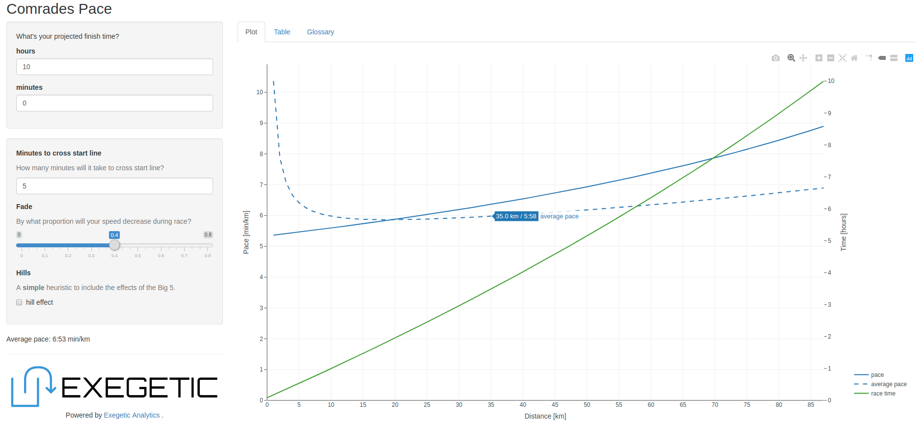
On the Plot tab is a figure which presents the following as a function of distance:
- time
- pace (the “instantaneous pace” as a function of distance) and
- average pace (averaged up to that point in the race).
The average pace curve is rather interesting because it will generally have a “bucket” shape. At the beginning of the race average pace will be slow due to the delay in crossing the line. However, over time the effect of this delay decays and average pace improves. Then, as you begin to slow down towards the end of the race (assuming that you’ve set fade to a value other than zero) average pace begins to climb once again. I find average pace much more useful than instantaneous pace because it smooths out effects of perturbations like water tables and wee breaks.
On the Table tab are the time and average pace projected at a number of landmarks along the route.