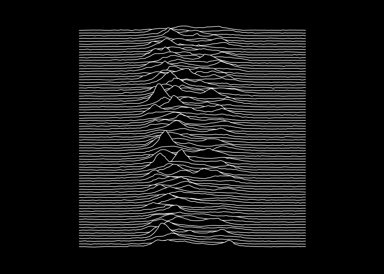
Recreating ‘Unknown Pleasures’ graphic
For some time I’ve wanted to recreate the cover art from Joy Division’s Unknown Pleasures album. The visualisation depicts successive pulses from the pulsar PSR B1919+21, discovered by Jocelyn Bell in 1967.

Data
The first obstacle was acquiring the data. I found a D3 visualisation by Mike Bostock. This in turn pointed me to a CSV file in a gist belonging to @borgar.
After reading the CSV data into pulsar I applied some light wrangling (the raw data is a matrix).
library(dplyr)
library(tidyr)

pulsar <- read.csv(CSV, header = FALSE) %>%
  mutate(row = row_number()) %>%
  gather(col, height, -row) %>%
  mutate(
    col = sub("^V", "", col) %>% as.integer()
  )
Plot
Thanks to the {ggridges} package, making the plot was simple.
ggplot(pulsar, aes(x = col, y = row, height = height, group = row)) +
  geom_ridgeline(min_height = min(pulsar$height),
                 scale= 0.2,
                 size = 1,
                 fill = "black",
                 colour = "white") +
  scale_y_reverse() +
  theme_void() +
  theme(
    panel.background = element_rect(fill = "black"),
    plot.background = element_rect(fill = "black", color = "black"),
  )
A few things worth noting:
- To get the sense of the rows right I had to reverse the direction of the y-axis (this was also important to ensure that the animation reveals from top to bottom).
- It’s necessary to set both the
colorandfillforplot.backgroundotherwise you get an irritating white outline.

Animation
Using transition_states() from the {gganimate} package I turned the static plot into an animation. I applied shadow_mark() with a value of alpha just below 1 to allow a small amount of transparency between each of the layers as the animation accumulates. This effect is not present in the original graphic, but I think that it’s informative to be able to see what’s happening “behind” each of the layers.
Epilogue
An anonymous contributor also sent me this version which uses only base R.
pulsar_matrix <- as.matrix(read.csv(CSV, header=F))

par(mar = c(0, 0, 0, 0))
plot(NULL, xlim = c(-100, 400), ylim = c(-10, 90), xaxs = 'i', yaxs = 'i')
rect(-105, -15, 405, 95, col = 'black')
for(i in 1:80) {
  polygon(
    c(1, 1:300, 300, 1),
    c(-1, 80 - i + pulsar_matrix[i,] / 10, -1, -1),
    col = 'black', border = 'white'
  )
}
segments(c(1, 300, 1), c(80, 80, -1),c(1, 300, 300), c(-1, -1, -1), col = 'black', lwd = 5)