I’ve been itching to do some analytics on my running data. Today seemed like a good time to actually do it.
I’ll be generating some plots using the {strava} package developed by Marcus Volz.
Get the Format Right
The GPS files in my Strava archive are in .fit format (some compressed, others not), which needed to be converted into .gpx format before I could consume them in R.
A quick BASH script using gpsbabel sorted that out.
#!/bin/bash

for f in *.fit.gz
do
  GPX=$(basename "$f" .fit.gz).gpx
  gzip -dc $f | gpsbabel -i garmin_fit -o gpx -f - -F $GPX
done

for f in *.fit
do
  GPX=$(basename "$f" .fit).gpx
  gpsbabel -i garmin_fit -o gpx -f $f -F $GPX
done
Plots
Start off by plotting thumbnails of each individual route.

Let’s see how those routes compound over time.
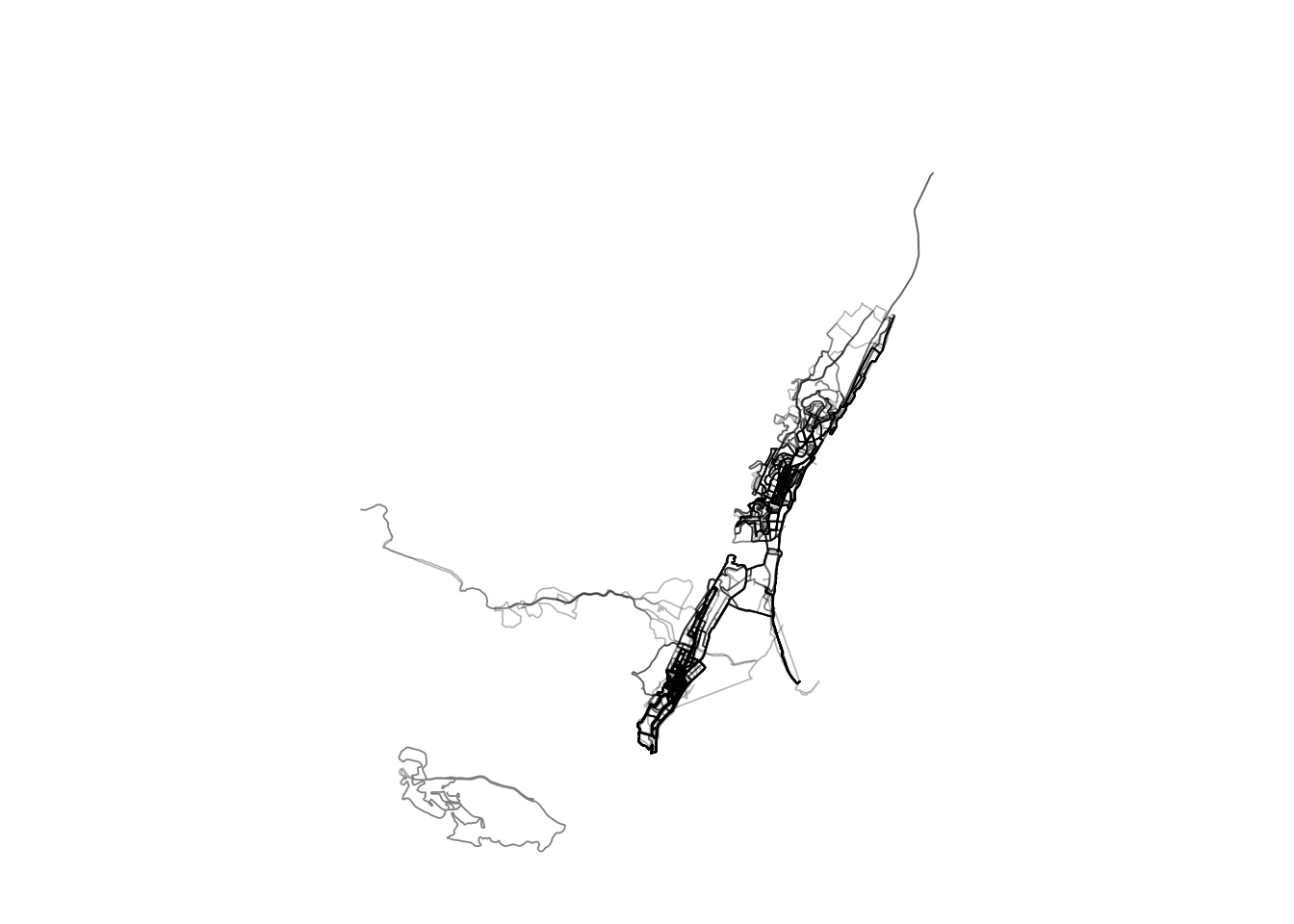
Obviously I’ve spent a lot of time running on the Berea and in Durban North. You can also see some of the Comrades Marathon, Hillcrest Marathon, Chatsworth Ultra and Ballito Marathon routes.
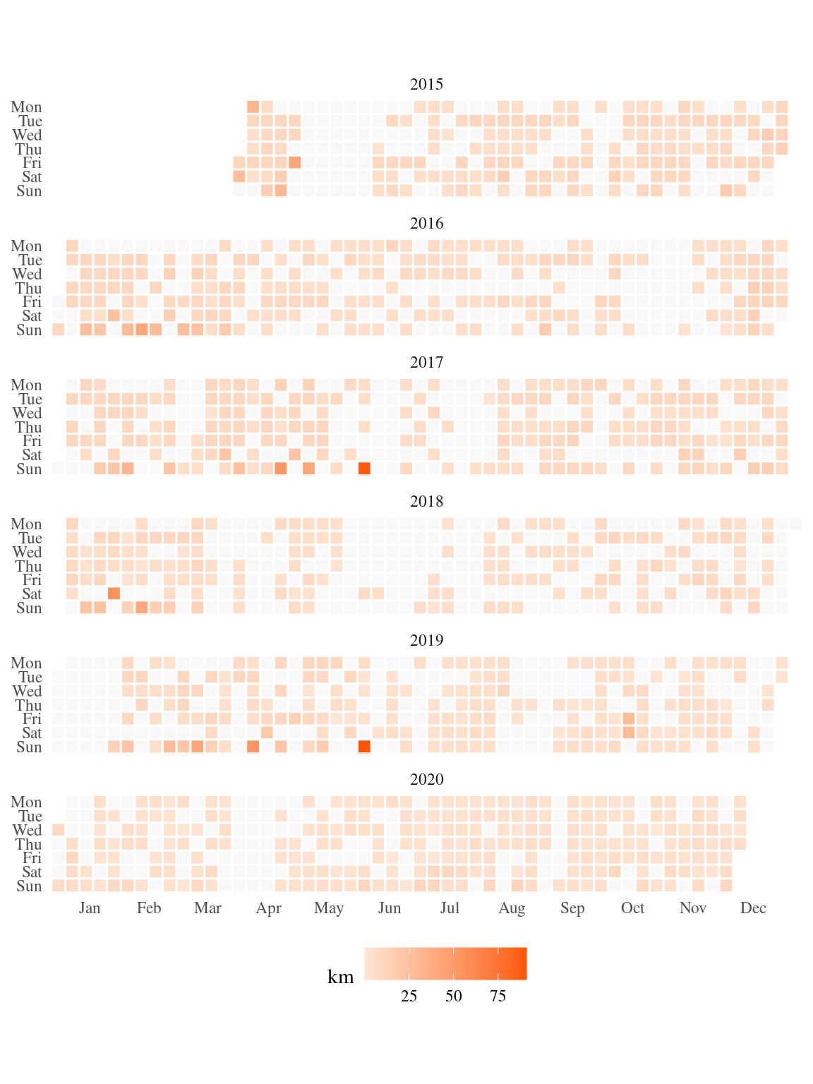
How were those runs distributed in time?
What times of day?
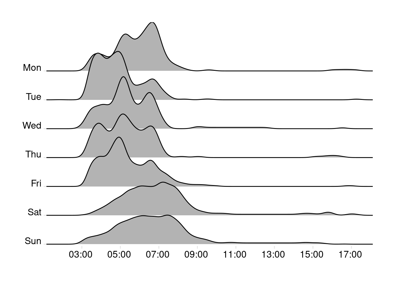
Times on week days are bimodal, probably because of a shift in behaviour since I have started working mostly from home (runs are now later because I don’t need to rush off to work).
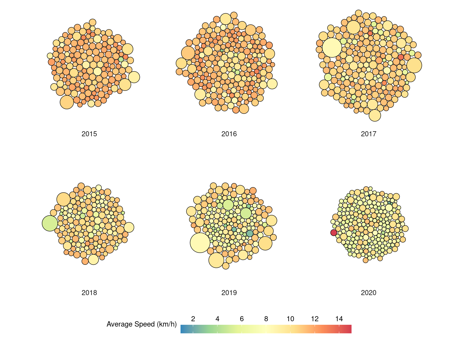
Finally, runs as packed circles, with distance mapped to circle area and speed as fill colour.
This has been seriously fun. Should have done it a lot sooner.