Making the Most of Mobility
The Google Mobility Data (or Community Mobility Reports) refers to the datasets provided by Google which track how people move and congregate in various locations during specific time periods. The data is based on anonymised location information from users who have opted into Location History on their Google accounts.
I became aware of the Community Mobility Reports data courtesy of this tweet from Mike Schussler:
Next time someone tells you that people are misbehaving you can tell the the data says no they are listening doing as they are told. Data from our mobile phones shows we staying away from retail, restaurants, transit parks etc, We have spent far more time at home 1 pic.twitter.com/bwSQKMPa0l
— mike schussler (@mikeschussler) January 10, 2021
The data are available for download from the Google COVID-19 Community Mobility Reports. There’s a global CSV file (data for all regions) as well as individual CSV files (one for each region, packaged in a ZIP archive). There are also automated PDF reports for each region per day. For example, this is the report for South Africa on 28 March 2021.
Background
The mobility data records how visits to various place categories have changed in frequency and duration. The place categories are:
- Workplaces
- Residential
- Grocery & Pharmacy
- Retail & Recreation
- Parks and
- Transit Stations.
The data for a specific day are relative to a baseline for that day of the week. The baseline is the median value for the corresponding day of the week during the 5 week period from 3 January 2020 to 6 February 2020. There is generally a delay of 2 to 3 days for new data, this being the time required to process and validate the data.
The data are gathered from users who opted in to Google’s Location History. As such it is only a sample of the wider population. It may or may not be representative and might be biased.
Load the Data
I’m focusing on the data for South Africa (ZA) and using both years of available data.
COUNTRY <- "ZA"
YEARS <- c(2020, 2021)
Use purrr::map_df() to iterate over each year, load the corresponding CSV and concatenate into a single data frame. A few of the columns are empty, so apply janitor::remove_empty() to drop those.
mobility <- map_df(
  YEARS,
  function(year) {
    filename <- glue("{year}_{COUNTRY}_Region_Mobility_Report.csv" )
    filepath <- file.path(FOLDER_REGIONAL_CSV, filename)
    read_csv(filepath)
  }
) %>%
  # Remove any empty columns.
  remove_empty(which = "cols") %>%
  # Remove columns with just one value.
  remove_constant() %>%
  # Rename specific columns.
  rename(
    region = sub_region_1,
    region_iso = iso_3166_2_code
  ) %>%
  # Strip "_percent_change_from_baseline" from column names.
  rename_with(
    ~ str_replace(.x, "_percent_change_from_baseline$", "")
  )
How much data?
dim(mobility)[1] 4080 10There are 4080 and 10 columns per record. The data span the period from 15 February 2020 to 28 March 2021.
What are the (revised) column names?
names(mobility) [1] "region" "region_iso" "place_id"
[4] "date" "retail_and_recreation" "grocery_and_pharmacy"
[7] "parks" "transit_stations" "workplaces"
[10] "residential" What are the unique place identifiers?
mobility %>% select(region, region_iso, place_id) %>% unique()# A tibble: 10 × 3
region region_iso place_id
<chr> <chr> <chr>
1 <NA> <NA> ChIJURLu2YmmNBwRoOikHwxjXeg
2 Eastern Cape ZA-EC ChIJu5znKjRWYh4RkqxyqdKUajo
3 Free State ZA-FS ChIJGRTWM2HFjx4RRwqiTVWK9e0
4 Gauteng ZA-GT ChIJn3cRVJUSlR4R4jhUy8fnnm0
5 KwaZulu-Natal ZA-NL ChIJVQ7iWQ4Q8R4Rjdnka6d4YYI
6 Limpopo ZA-LP ChIJwTDNNhTJxh4RStzIZh49iWI
7 Mpumalanga ZA-MP ChIJPSAvTvpg6h4RhGvk9A3foGQ
8 North West ZA-NW ChIJ612A6EIKmB4R_5BkMf6qLUc
9 Northern Cape ZA-NC ChIJbUtwf_UhJBwRkEyPkNb4AAM
10 Western Cape ZA-WC ChIJ841peohdzB0Ri6I2IY95jukThere’s data for each province as well as for the country as a whole. We’ll confine our attention to the country as a whole.
Visualise the Data
We’ve got daily observations of various mobility metrics for each of the provinces as well as the country as a whole. Making sense of this is going to require pictures!
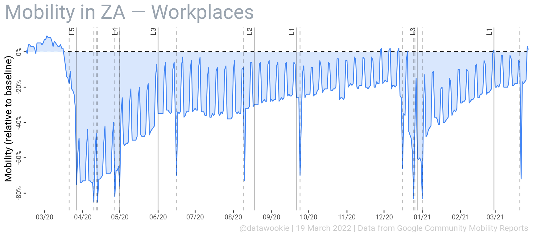
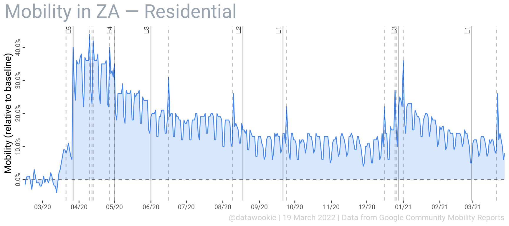
Work & Home
Below are the two plots of the mobility percentage for workplaces and residential areas. Superimposed are solid vertical lines that indicate the onset of each lockdown level, starting with Level 5 (L5) on 27 March 2020. On that date there was a precipitous drop in the number of people moving to their workplaces and a simultaneous increase the people staying at home. Vertical dashed lines indicates public holidays, which also appear to have a significant effect on mobility.
There’s a clear weekly variation in these data, indicating that, despite the lockdown, people’s behaviour is different on weekends and during the week.
Shopping & Recreation
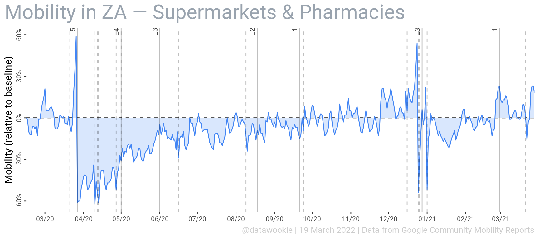
What about shopping and recreation habits?
The data indicate that following the initial lockdown there was a substantial reduction in visits to supermarkets and pharmacies, but that this has largely recovered.
Including restaurants, cafés, shopping centres, libraries, cinemas and other recreational venues paints a different picture. The impact on the entertainment industry due to restrictions on the sale of alcohol has no doubt played a role in this.
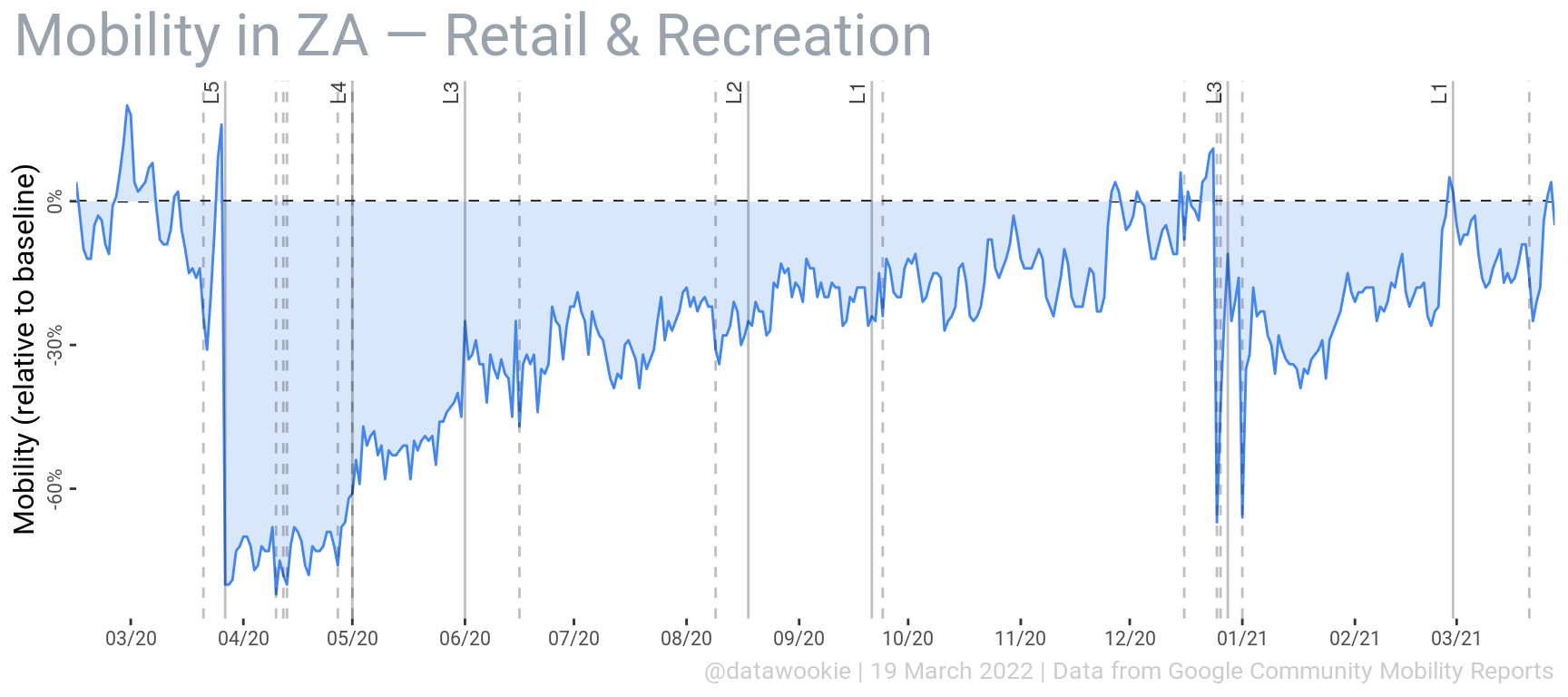
Interestingly it seems that public holidays do not have a major effect on people going shopping or hitting recreational venues.
Out & About
Public spaces, like beaches, parks and gardens, have also been impacted. There’s some interesting variation here which I don’t fully understand right now. For instance, why was there less use of public spaces following the transition to Level 1 in September 2020?
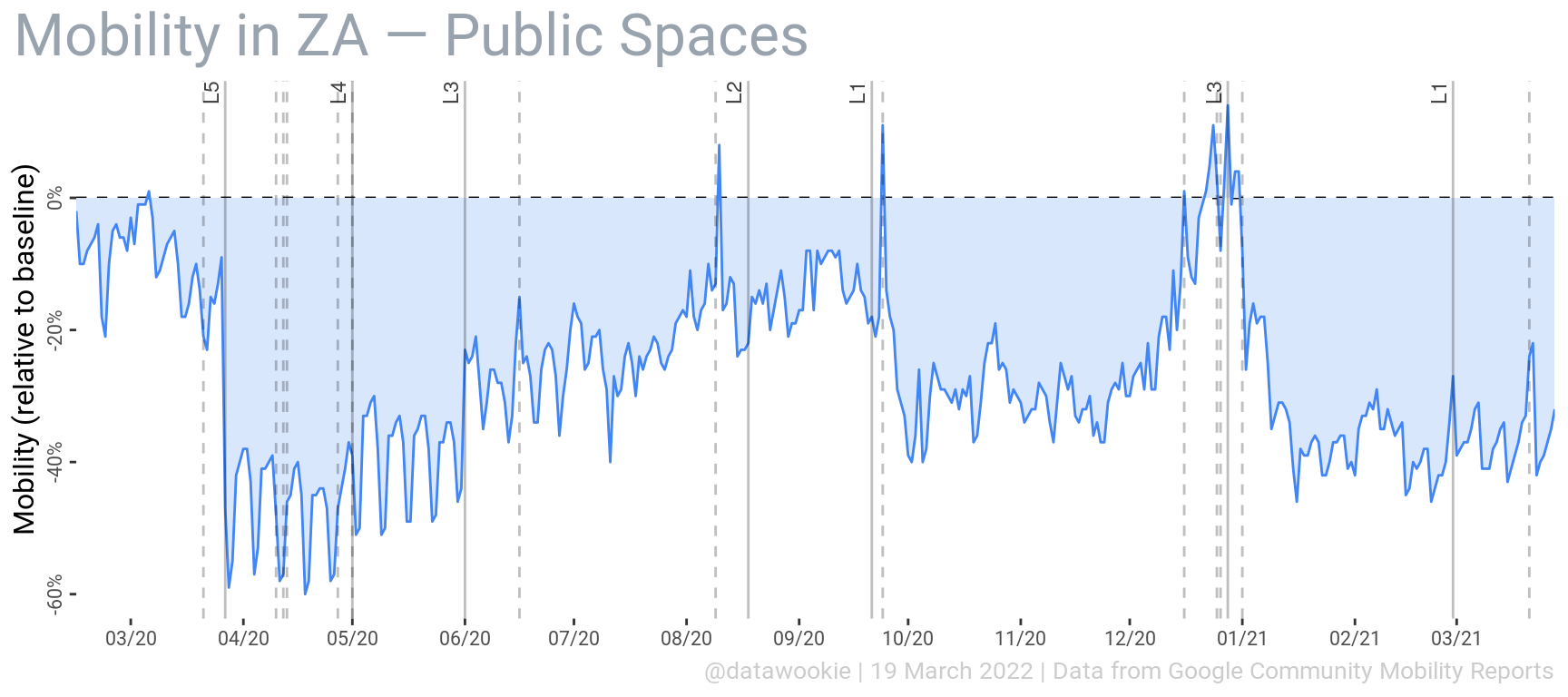
Public holidays cause major spikes in the use of public spaces, at least under lockdown levels 3, 2 and 1.
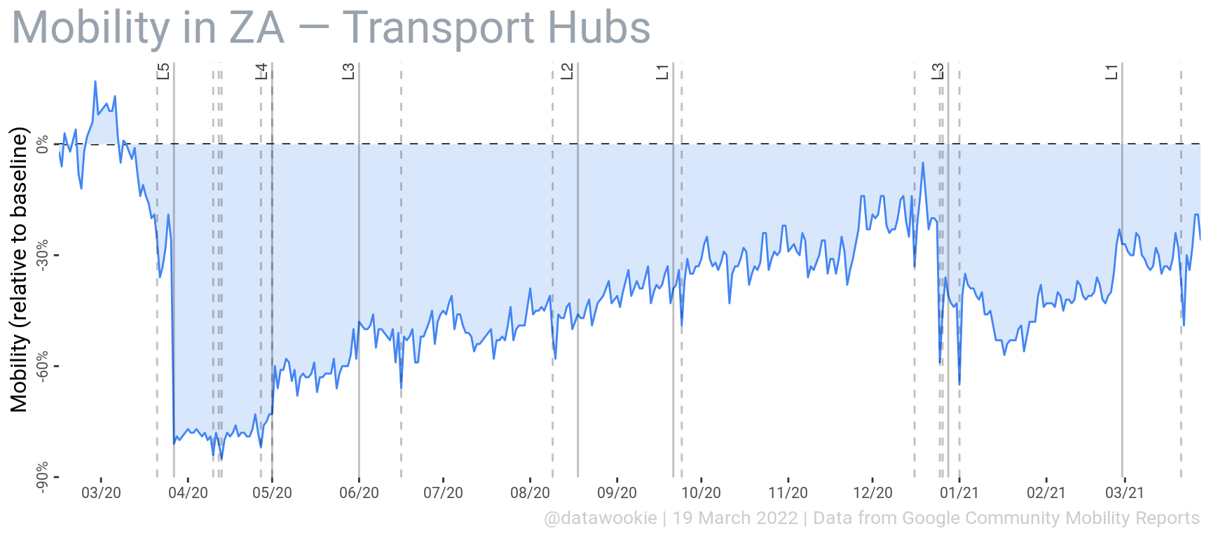
Finally, transport hubs, which includes train and bus stations as well as airports, were practically empty following the initial lockdown. However, they gradually became more busy during the course of 2020. Travel activity dropped again after Christmas 2020.
This is a very rich data set with lots of opportunities for interesting analyses. Time permitting I’ll be back to look at it again.