Vertically Align an Image and Text in a div
I’m not a web developer. However, I do regularly use HTML and CSS to layout pages which are then transformed into PDF documents. One of the requirements that I encounter fairly often is vertically aligning images and text. Fairly often, but not often enough to remember the solution. I inevitably have to rediscover the solution (thanks StackOverflow!). Jotting this down for posterity.
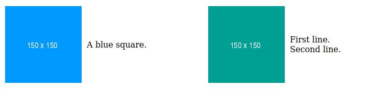
This is what we are aiming to achieve:
Single Line of Text
Let’s start with the simpler setup on the left. Here’s the HTML.
<div class="aligned">
A blue square.
</div>To get the alignment right we need to set display for the enclosing <div> to flex and choose center for align-items.
Here’s a complete HTML document with the required CSS inlined into the header.
<!DOCTYPE html>
<html>
<head>
<style>
.aligned {
display: flex;
align-items: center;
}
.aligned > img {
margin-right: 10px;
}
</style>
</head>
<body>
<div class="aligned">

A blue square.
</div>
</body>
</html>Multiple Lines of Text
If there are multiple lines of text then you can split them with <br>.
<div class="aligned">
First line.<br>Second line.
</div>Or if you want more granular control over the formatting of individual lines, then throw in an additional layer of <div> tags.
<div class="aligned">

<div>
<div>First line.</div>
<div>Second line.</div>
</div>
</div>Here’s a complete HTML document with the required CSS inlined into the header.
<!DOCTYPE html>
<html>
<head>
<style>
.aligned {
display: flex;
align-items: center;
}
.aligned > img {
margin-right: 10px;
}
</style>
</head>
<body>
<div class="aligned">

<div>
<div>First line.</div>
<div>Second line.</div>
</div>
</div>
</body>
</html>Stacked
What if you want to stack multiple items next to each other? Just float them! The clearfix class is used to group together the floating content.
<!DOCTYPE html>
<html>
<head>
<style>
.aligned {
display: flex;
align-items: center;
float: left;
margin-right: 10px;
}
.aligned > img {
margin-right: 10px;
}
.clearfix::after {
content: "";
clear: both;
display: table;
}
</style>
</head>
<body>
<div class="clearfix">
<div class="aligned">
A blue square.
</div>
<div class="aligned">

A green square.
</div>
</div>
<p>Text after squares.</p>
</body>
</html>This may not be the best way to do this. But I’m pragmatic: if it works, then it’s generally good enough.