I’m a density plot devotee. And, using geom_density() from {ggplot2} these plots are effortless to produce. However, sometimes the results of geom_density() are not exactly what I’m after. Here’s how I tweak them to give me precisely what I need.
The Data
We’ll use a slightly modified version of the penguins data from the {palmerpenguins} package. The data have been filtered to reduce the number of records for Chinstrap penguins by 50% and the number of records for male penguins (all species) by 75%. The distribution of samples across the species and sex dimensions is now skewed, with male and Chinstrap penguins being relatively scarce.
I have also included data for the recently discovered (and possibly apocryphal) Sparkle penguin species (believed to have been named by a precocious 6 year old with a passion for shiny things and unicorns).
# A tibble: 8 × 3
  species   sex    count
  <fct>     <fct>  <int>
1 Adelie    female    73
2 Adelie    male      18
3 Chinstrap female    17
4 Chinstrap male       4
5 Gentoo    female    58
6 Gentoo    male      15
7 Sparkle   female    80
8 Sparkle   male      10
The total sample count is 275, of which 47 are male and 228 are female.
Sparkle Penguins
Let’s start by focusing our attention on those Sparkle penguins. The data consists of 10 male and 80 female Sparkle penguins. Let’s generate a density plot of flipper length using geom_density().
ggplot(sparkle) +
  geom_density(aes(x = flipper_length_mm, fill=sex), alpha = 0.5)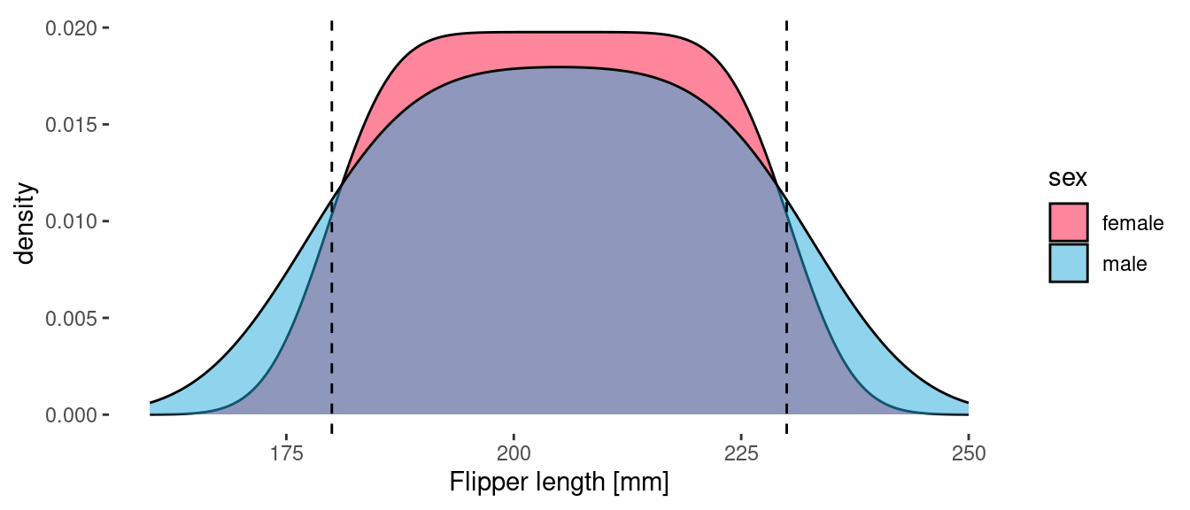
One of the unique (and remarkable!) characteristics of this species is that the length of their flippers is uniformly distributed between 180 and 230 mm. These bounds are indicated by the vertical dashed lines. The above plot is completely consistent with this: the flipper length density is the same (or at least very similar!) for the two sexes. The difference between the curve for male and female is an artifact of the kernel density estimator used by geom_density(). Since there are more observations of female Sparkle penguins, the distribution of flipper lengths is sharper (closer to square). The area under both curves is 1, which means that each curve can be interpreted as a probability density function (PDF).
But what if we want to actually plot the density of observations (in penguins per mm)? To do this we need to add in a y aesthetic and use the after_stat() function to delay the mapping.
ggplot(sparkle) +
  geom_density(aes(x = flipper_length_mm, y = after_stat(count), fill=sex), alpha = 0.5) +
  facet_grid(sex ~ .)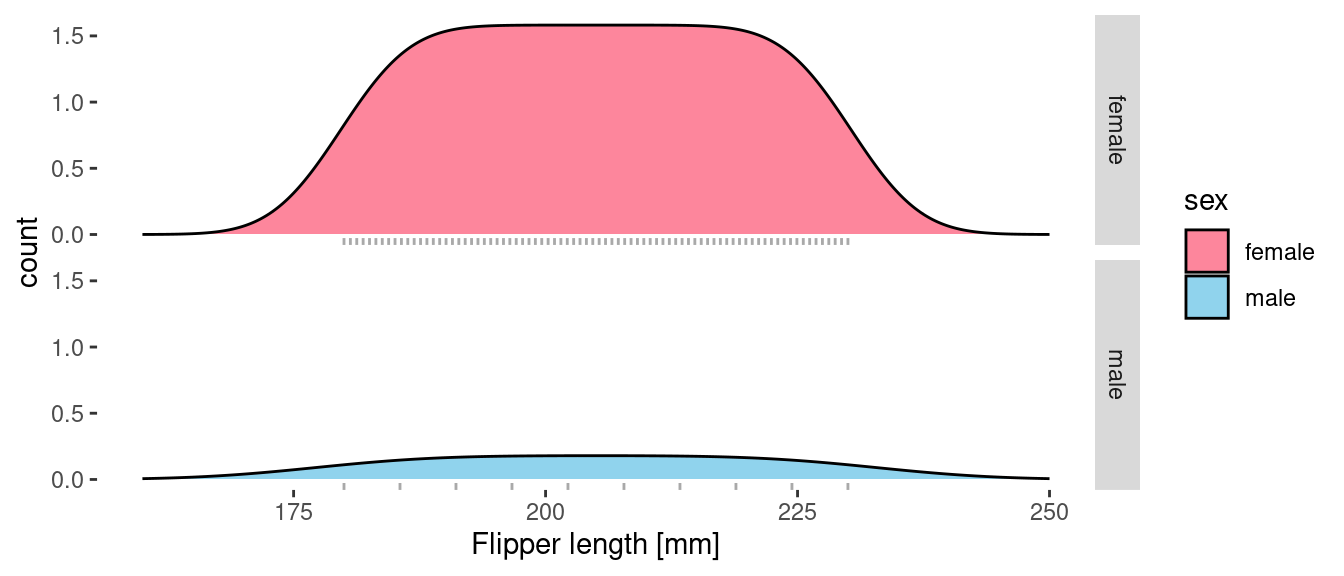
The shape of the curves remains the same, but now the area under the curves reflects the number of samples for each sex and the height of the curve represents the density of penguins in the sample (in penguins per mm). I’ve split the plot into two facets and overlaid a rug onto each to show the actual distribution of the samples.
Now we have two different views of the data arising from geom_density():
- a smoothed estimate of the underlying distribution and
- a smoothed distribution of the actual samples.
All the Penguins
Let’s broaden our scope and include all of the penguins. First let’s take a look at the vanilla output from geom_density(). This shows us the distribution of flipper length across all species broken down by gender. Each curve gives the appropriate PDF. If we wanted to generate samples of flipper length with the appropriate distribution, then this is the data that we would want.
ggplot(penguins) +
  geom_density(aes(x = flipper_length_mm, fill=sex), alpha = 0.5) +
  facet_grid(sex ~ .)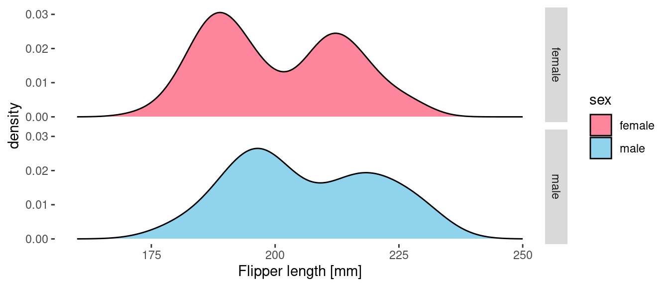
If, however, we provide a delayed count as the y aesthetic them we get the count density of penguin samples in the data. These curves tell us more about the actual sampled data than they do about the underlying distributions.
ggplot(penguins) +
  geom_density(aes(x = flipper_length_mm, y = after_stat(count), fill=sex), alpha = 0.5)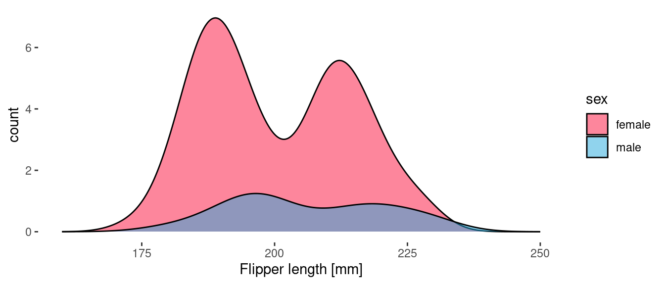
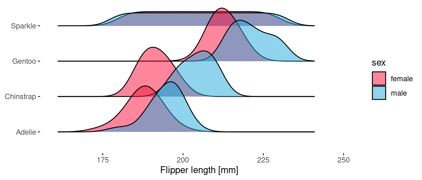
Penguins on the Ridges
The {ggridges} package includes geoms which provide a complementary view to geom_density() and work particularly well when you need to break the data down into a number of categories. The same two views can be produced here too.
ggplot(penguins) +
  geom_density_ridges(
    aes(x = flipper_length_mm, y = species, fill = sex),
    scale = 1.5,
    alpha = 0.5
  )
Because geom_density_ridges() uses the y aesthetic to determine the ridge offset, we use the height aesthetic to specify the delayed count.
ggplot(penguins) +
  geom_density_ridges(
    aes(x = flipper_length_mm, y = species, fill = sex, height = after_stat(count)),
    stat="density",
    scale = 1.5,
    alpha = 0.5
  )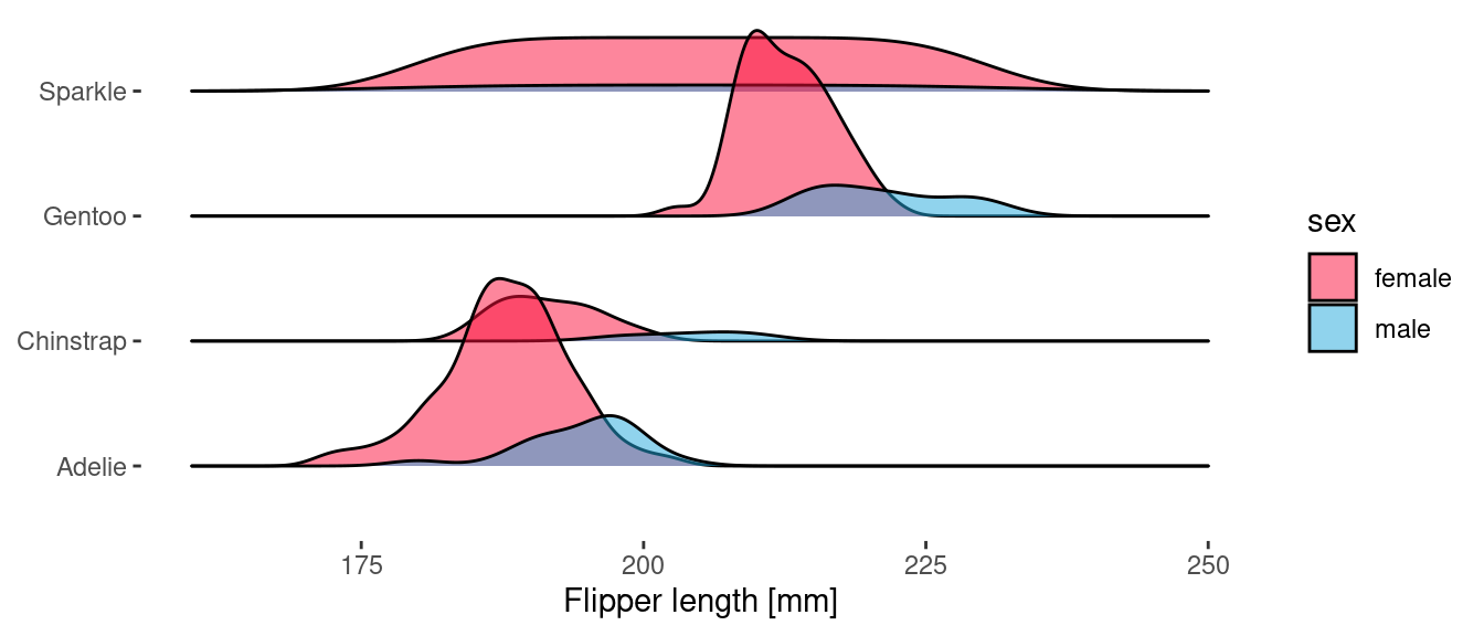
Something similar could be achieved directly with {ggplot2} by using facets, but I think that ridgeline plots really are 🚀.