In the previous installment we generated a few plots using numerical data straight out of the National Health and Nutrition Examination Survey. This time we are going to incorporate some of the categorical variables into the plots. Although going from raw numerical data to categorical data bins (like we did for age and BMI) does give you less precision, it can make drawing conclusions from plots a lot easier.
We will start off with a simple plot of two numerical variables: age against BMI.
plot(DS0012$BMI, DS0012$age, xlab = "BMI", ylab = "age", pch = 19,
col = rgb(0, 0, 0, 0.1))
This produces a scatter plot.
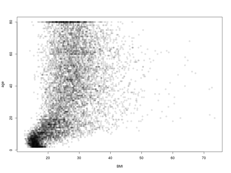
The conclusion that one can draw from this is that, with the exception of children, there is a wide range of BMI values in the data and that there is a tendency for BMI to increase through adulthood and into middle age, where is appears to stabilise. This is a rather busy plot though. A simpler presentation of the data can be achieved by replacing one of the numerical variables with its categorical derivative. Let’s consider the relationship between age and BMI category.
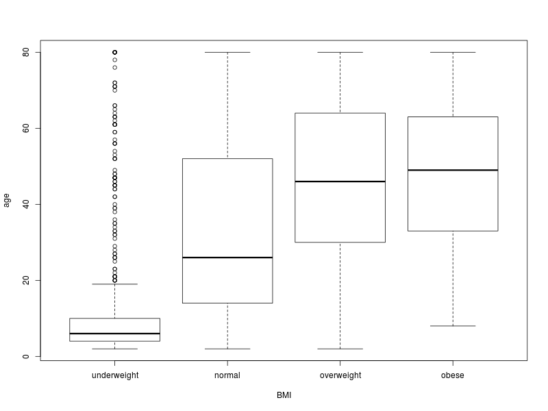
plot(DS0012$BMI.category, DS0012$age, xlab = "BMI", ylab = "age")
This produces a boxplot or box-and-whisker plot. For each BMI category there is a box which extends from the first to the third quartile. The dark line within the box is the median. The whiskers extend 1.5 times the interquartile range (IQR) below and above the first and third quartiles. Points lying outside the whiskers can be thought of as outliers. What we can see from this plot is that the median age increases as one moves from the normal to the overweight and finally to the obese categories. Whereas the centre of the age distribution for people with normal BMI is centred in the twenties, it shifts to the forties for the overweight and obese categories.
Next we plot two categorical variables against each other.
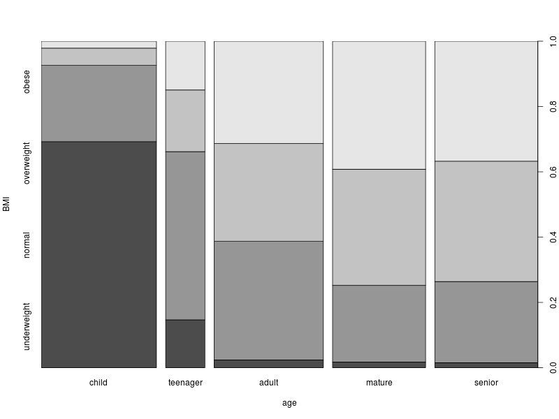
plot(DS0012$age.category, DS0012$BMI.category, ylab = "BMI", xlab = "age")
This produces a spineplot. The first thing to note is that the widths of the columns is proportional to the number of samples in each of the corresponding age categories. For example, the number of teenagers is less than half the number of adults.
> table(DS0012$age.category)
child teenager adult mature senior
2220 757 2105 1793 1986
Within each of the columns, the shaded areas correspond to the proportions of the corresponding BMI categories. To make things easier to read, there is a proportion scale on the right of the plot. To illustrate, roughly 10% of teenagers are underweight. Between 60% and 70% of teenagers are either underweight or normal. Only a few percent of older people are underweight. About 40% of mature and senior people are obese.
That’s one way of looking at those data. Of course, we can swop things around.
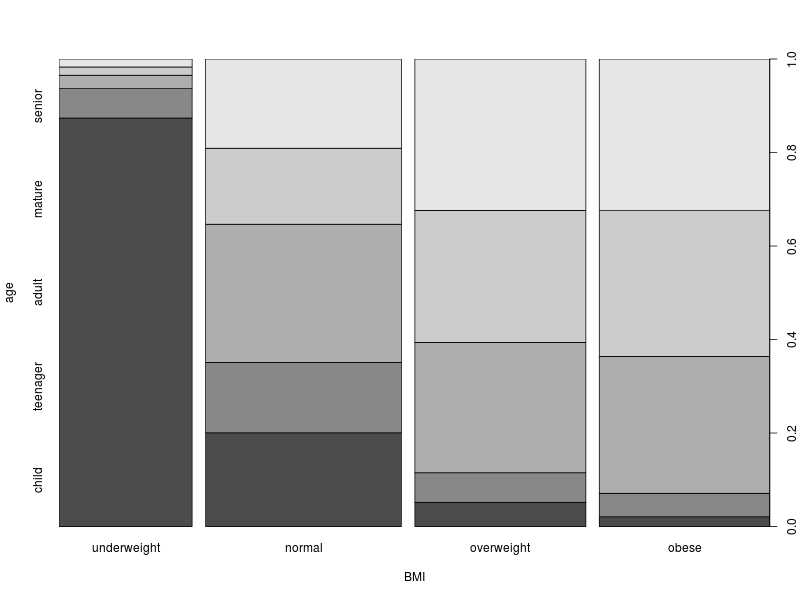
plot(DS0012$BMI.category, DS0012$age.category, xlab = "BMI", ylab = "age")
Now the widths of the columns correspond to the number of samples in each of the BMI categories. We see that the largest category in the sample is normal. But not by a large margin. And the total number of samples in the other ‘abnormal’ categories is close to three times the size of the normal category. Now the areas within the columns reflects the distribution of ages within each of the BMI categories.
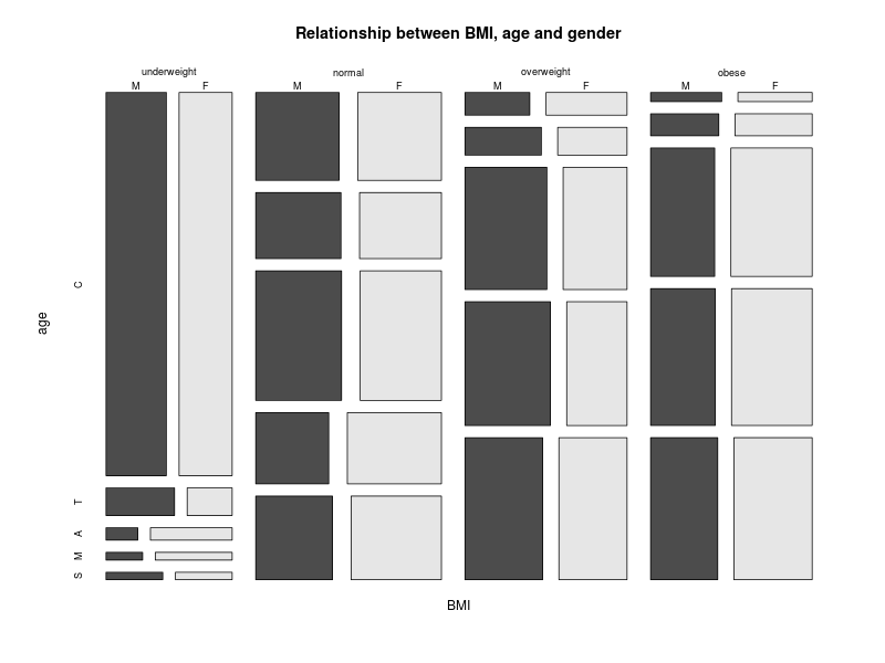
What about plotting more than two categorical variables? We will use the three way contingency plot that we generated previously. But first we will change the labels for the age category to something a little more compact. You’ll see why in a moment.
attributes(bmi.age.gender)$dimnames$age <- c("C", "T", "A", "M", "S")
#
mosaicplot(bmi.age.gender, main = "Relationship between BMI, age and gender",
xlab = "BMI", ylab = "age", cex = 0.75, color = TRUE)
This gives us a mosaic plot. The format and interpretation are analogous to those of the spineplot.
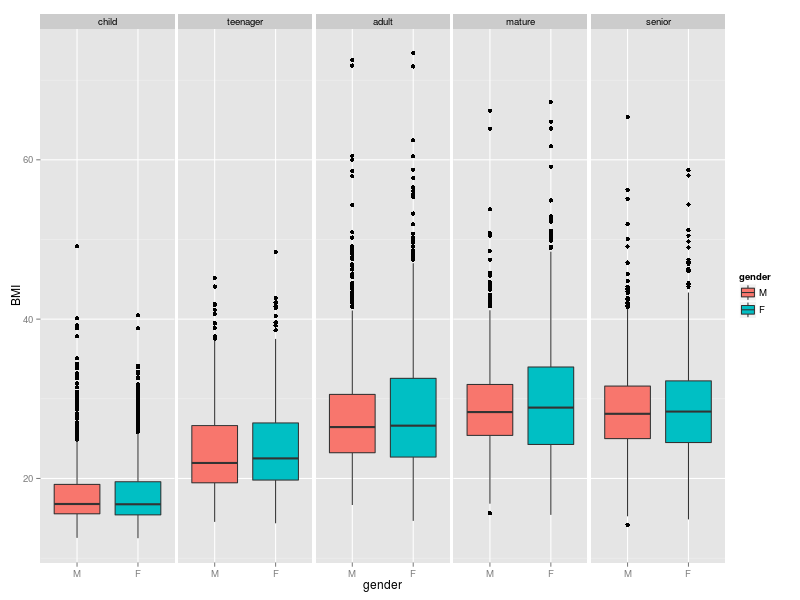
Finally, like I did last time, I will throw in an example of using ggplot2 for categorical plots.
library(ggplot2)
ggplot(DS0012, aes(x = gender, y = BMI, fill = gender)) + geom_boxplot() +
facet_wrap(~ age.category, ncol = 5)
This uses the faceting capability to produce a plot with five panels: one panel for each age category. Within each panel is a boxplot which characterises the distribution of BMI for each gender within that age category. To my mind, this is a really attractive plot. It indicates that within each age category the median BMI does not differ significantly between genders although the IQR is generally larger for females. BMI tends to increase until adulthood and the highest BMI values are found in adults. This provides a view on the data which is complimentary to the first boxplot above.
Well, that’s all for plotting categorical data. Next time we will have a look at some simple statistical tests.