
In the previous post we loaded stock data into R and then calculated return volatility, both for the entire time series and shorter intervals. We saw that volatility is not constant but can change appreciably with time. One way to get a clear view of changes in volatility is by calculating them using a moving or (“rolling”) window.
Daily Return Volatility
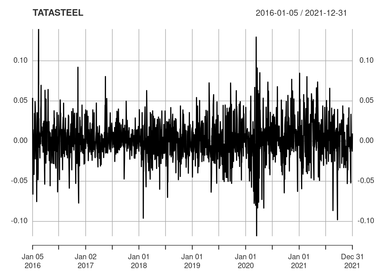
The plot below shows the daily returns for Tata Steel. It’s apparent that there is substantial variability in the returns from one day to the next and that there are also periods of higher or lower variability.
plot(TATASTEEL)
This view of the data is illuminating, but the granularity does obscure the underlying information. Some form or smoothing or averaging would help to make the picture clearer.
Rolling Volatility
The chart.RollingPerformance() function in the PerformanceAnalytics package can be used to plot rolling volatility.
chart.RollingPerformance(
  R = TATASTEEL,
  width = 21,
  FUN = "sd.annualized",
  scale = 252,
  main = "Rolling Annualised Volatility (1 month)"
)
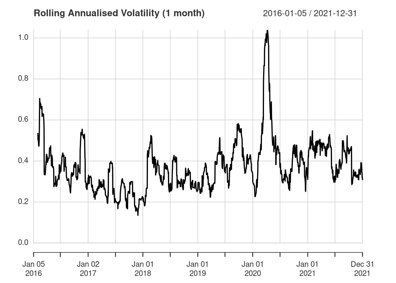
This is a lot clearer than the raw time series plot and clearly shows the large peak in volatility in 2020.
Let’s examine the options passed to chart.RollingPerformance():
R = TATASTEEL— anxtstime series of returnswidth = 21— how many values to include in the rolling window (on average there are 21 trading days in a month)FUN = "sd.annualized"— thesd.annualized()function is used to calculate the annualised volatilityscale = 252— the granularity of the time series data, which is daily so that 252 is the number of periods in a year (the average number of trading days in a year).
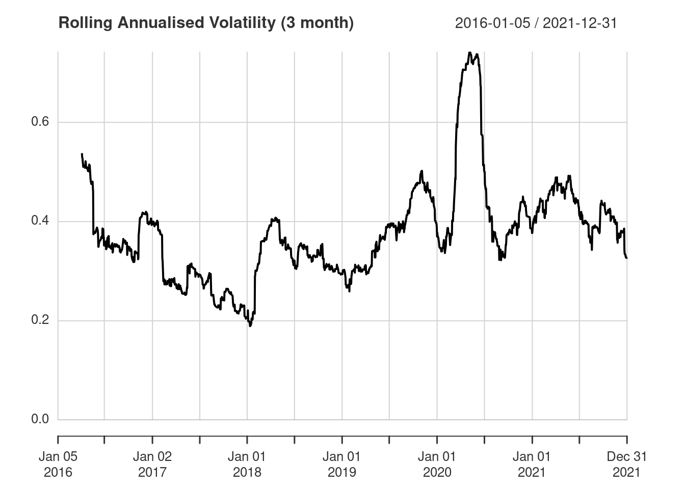
We can further smooth the data using a three month rolling window by changing width from 21 to 63.
chart.RollingPerformance(
  R = TATASTEEL,
  width = 63,
  FUN = "sd.annualized",
  main = "Rolling Annualised Volatility (3 month)"
)
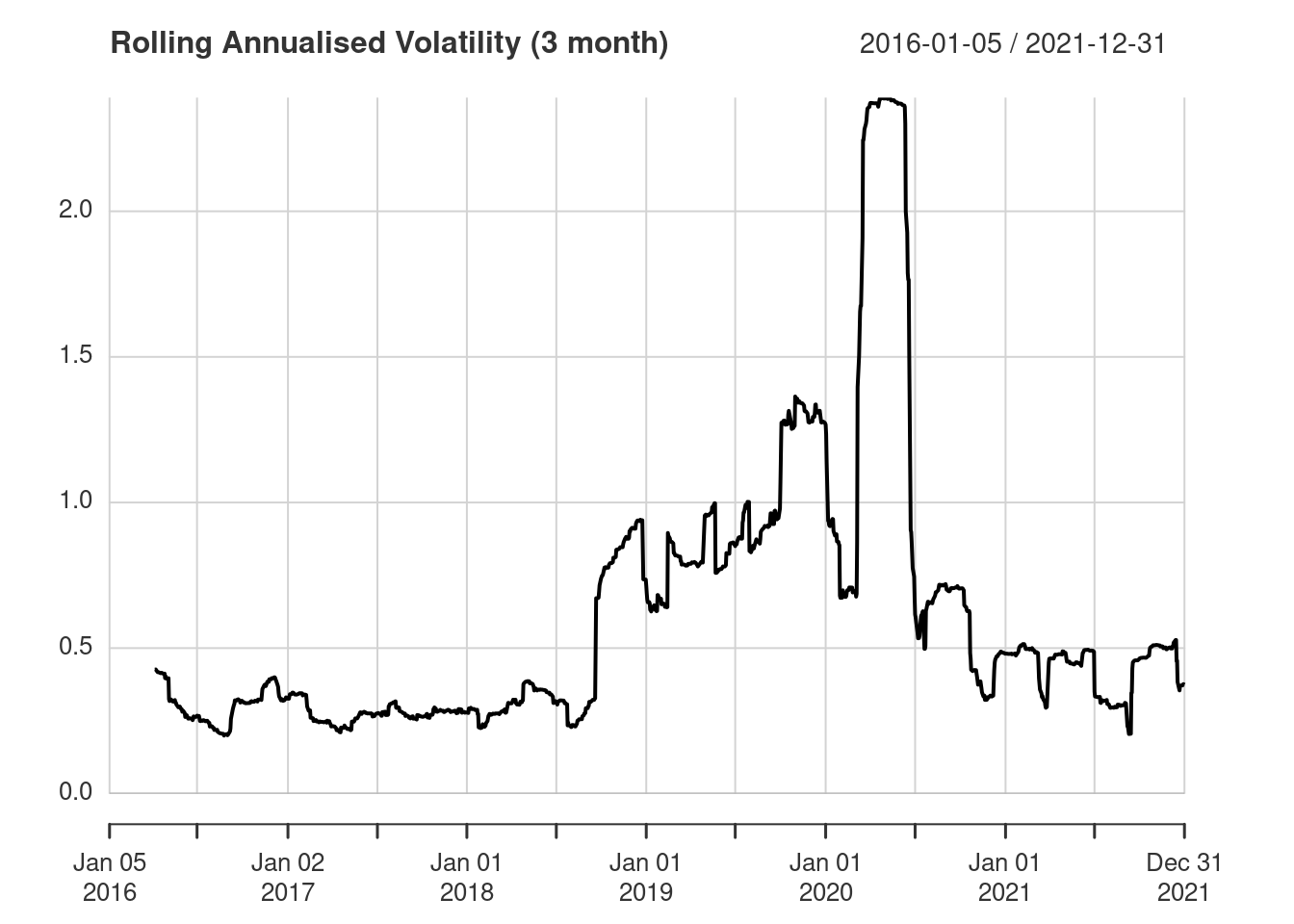
For comparison, here’s the 3 month rolling annualised volatility for Yes Bank.
Rolling Return
The chart.RollingPerformance() function can be used to calculate a variety of rolling metrics. For example, you can also use it for a rolling annualised return. This time we’ll also look at multiple stocks on the same plot.
returns <- merge(ACC, YESBANK, TATASTEEL)
Annualised return is the default function, so we can omit the FUN argument. The plot below shows the annualised returns for ACC (black), Yes Bank (red) and Tata Steel (blue).
chart.RollingPerformance(
  R = returns,
  width = 66,
  colorset = c("black", "red", "blue"),
  main = "Rolling Annualised Return (3 month)"
)
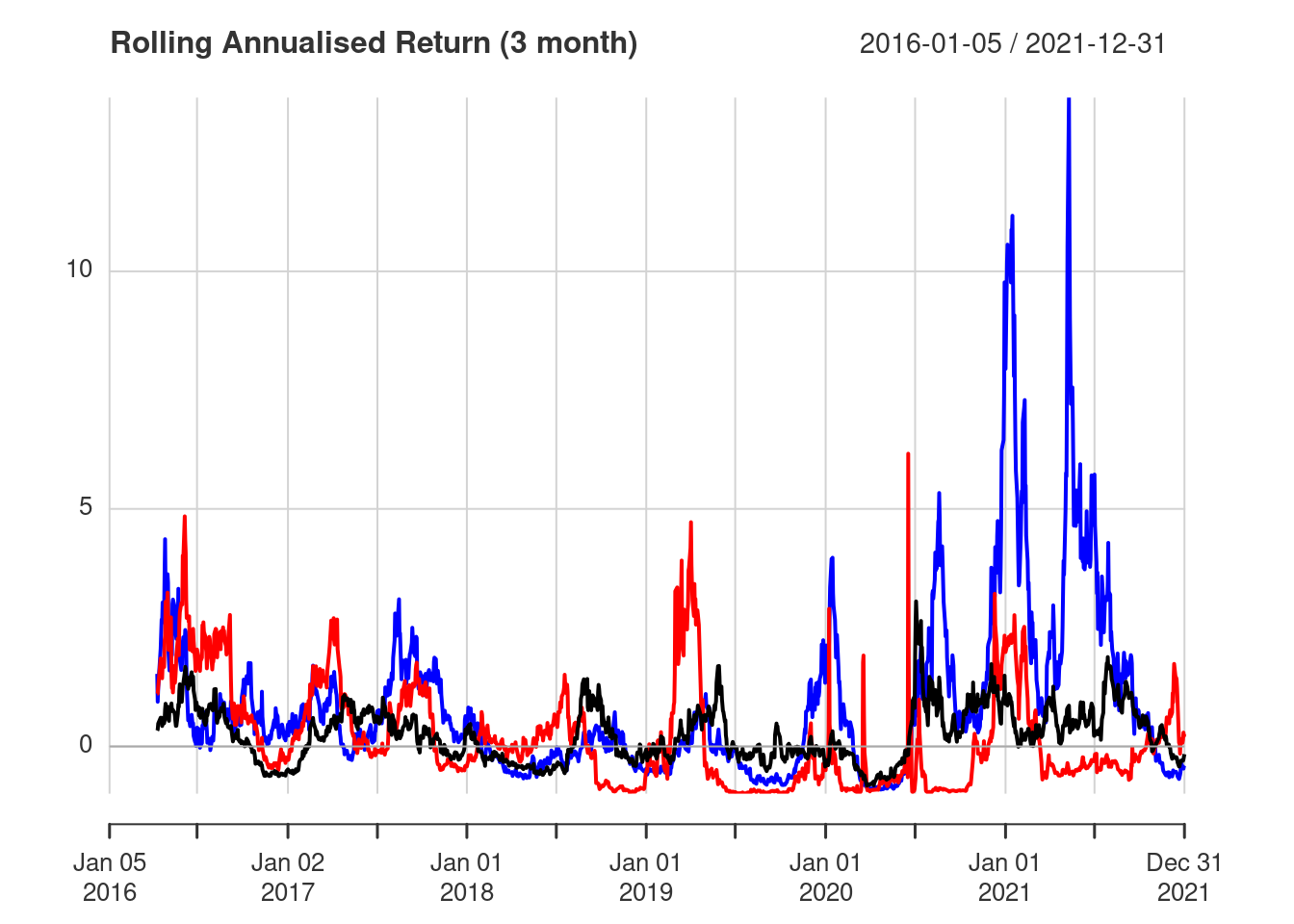
Of the three stocks Tata Steel shows the best annualised returns in recent years, peaking above 10% in 2021.
Conclusion
The chart.RollingPerformance() function is useful for visualising rolling averages and can apply an arbitrary function to data in the rolling window.